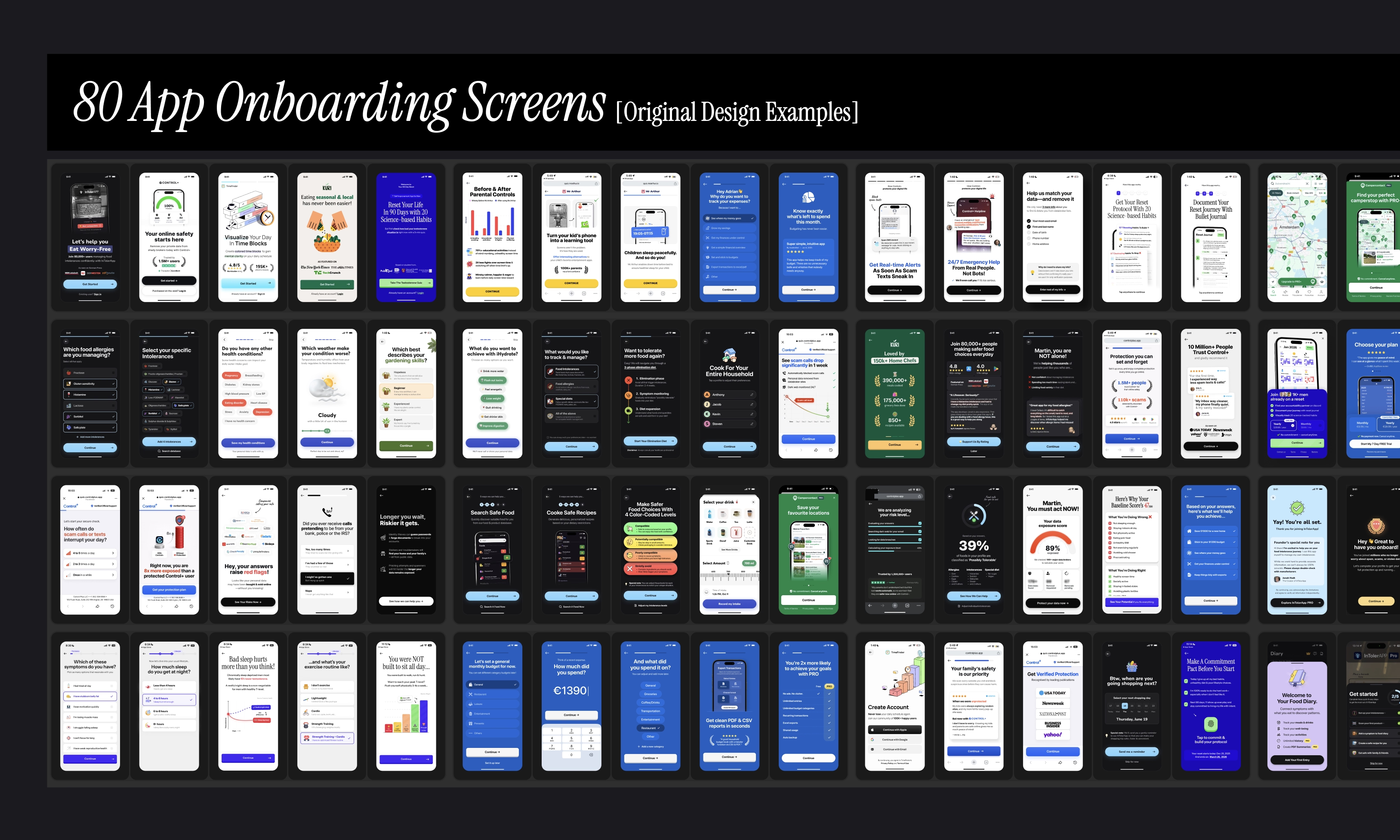
Image: 80 app onboarding screens [original designs by roastmyapp]
"It's amazing how many of my little inputs made their way into the new onboarding design." —Timo
"Your onboarding designs are outstanding. I love having high quality options to try out next." — Luke
"The new onboarding screens are truly beautiful and fit my app very well." —Jonah
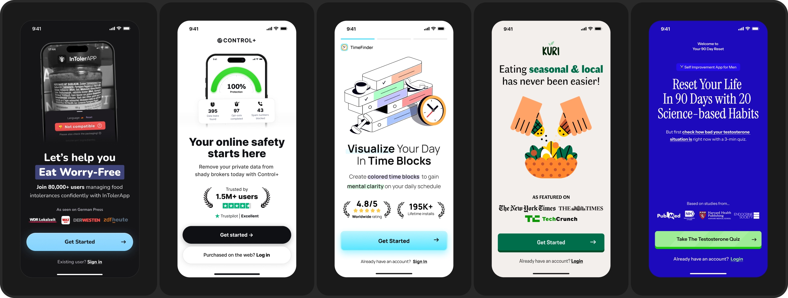
The first set of screens after install. It tells people what the app is for and gets them into the funnel. This is also where we find significant drop-offs. Mostly when the promise made at the top of the funnel does not continue after install.
People arrive carrying an expectation from an ad creative, a store listing or a search. The welcome screen either confirms it or breaks it. Match the narrative, not just the branding. Value proposition headline should echo the creative that brought them in.
How it looks in design: Ratings, install counts or press logos sitting directly underneath so the trust carries across. One primary action, and a small sign in link for people who already have an account.
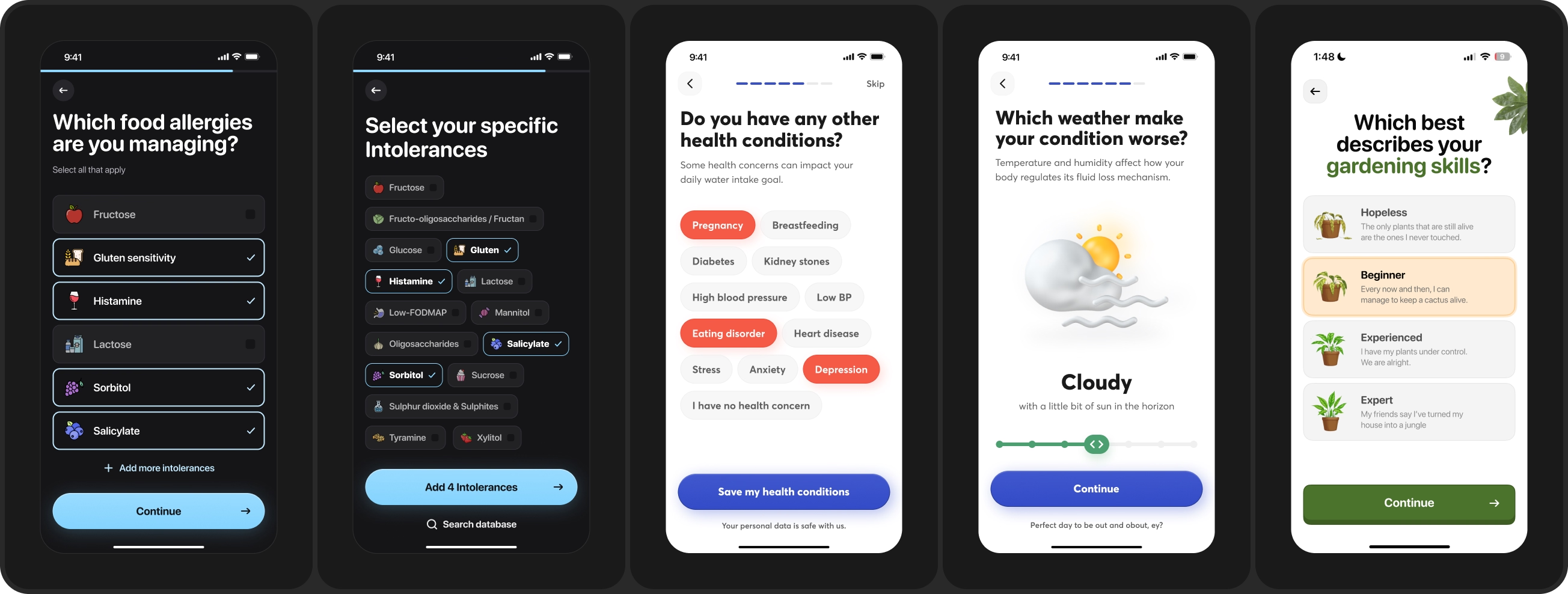
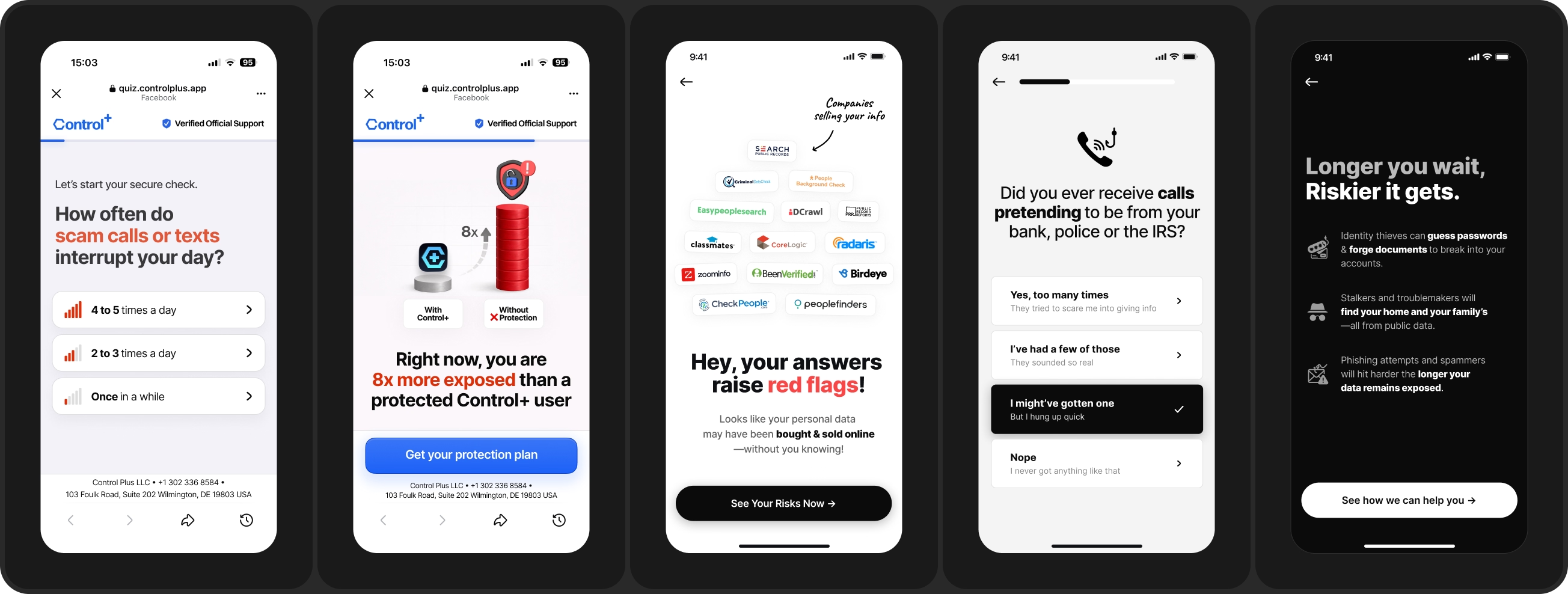
These are questions, feedback, and content screens designed to call out the pain, problems & obstacles that people came here with.
How it looks in design: quiz questions with various input methods like multi-select symptom lists, chip pickers & sliders. Feedback screens address the cost of inaction, or shows what happens if they stay on the path they are on.
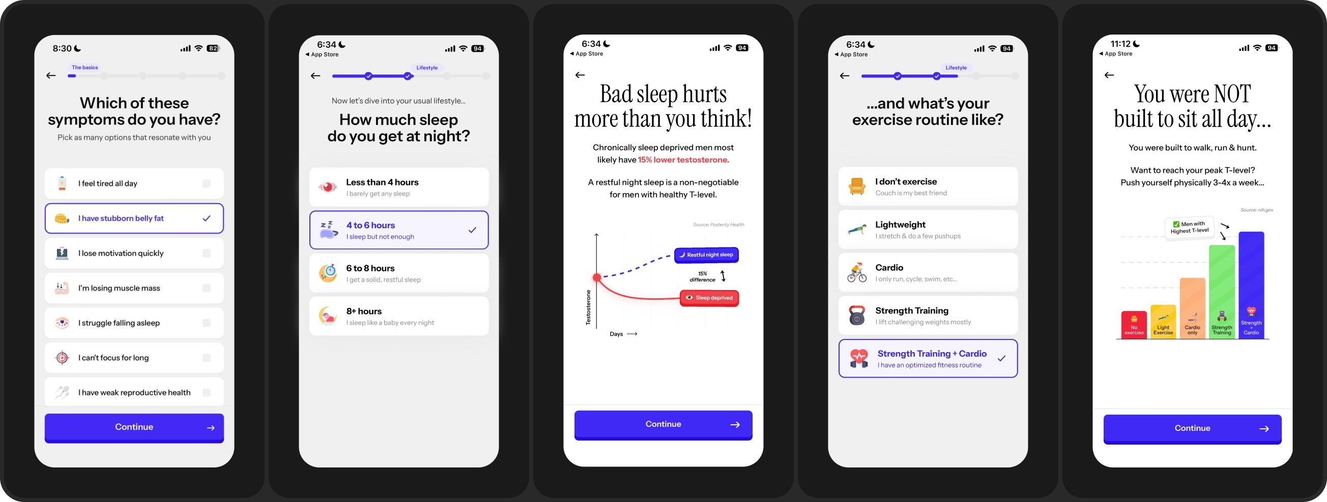
These onboarding screens show the other side of the problem. The ideal outcome, the transformation, the before and after.
Once people share what's wrong, they need to see what fixed looks like before they keep going. Keep the promise bold but slightly incomplete. Enough to keep them moving, not the full pitch. The full pitch is what the paywall is for.
How it looks in design: goal questions, projected graph, before-after comparison, or a quick taste of the best case scenario they could be in.
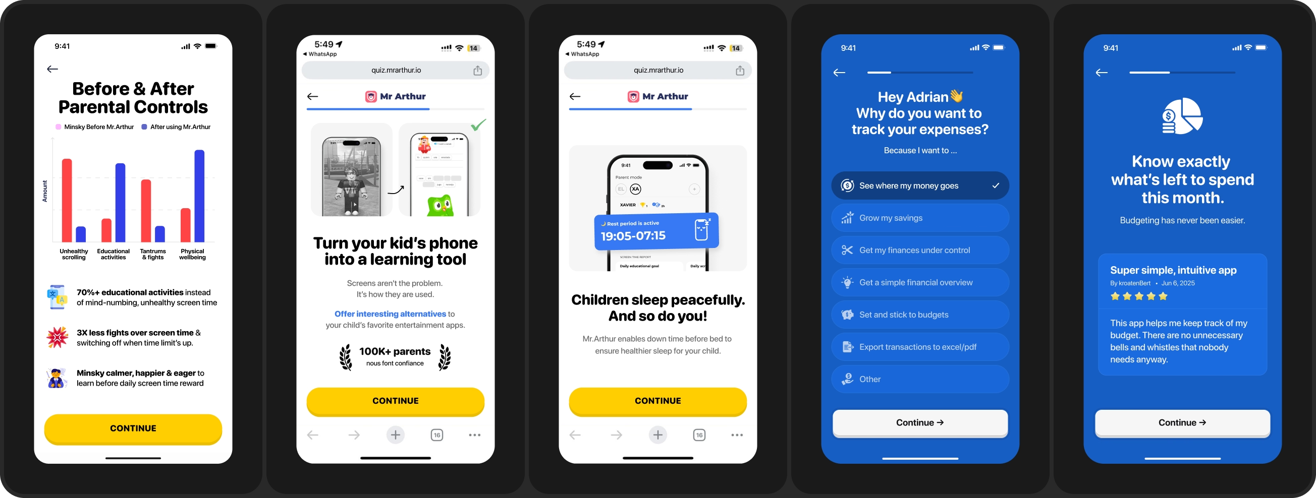
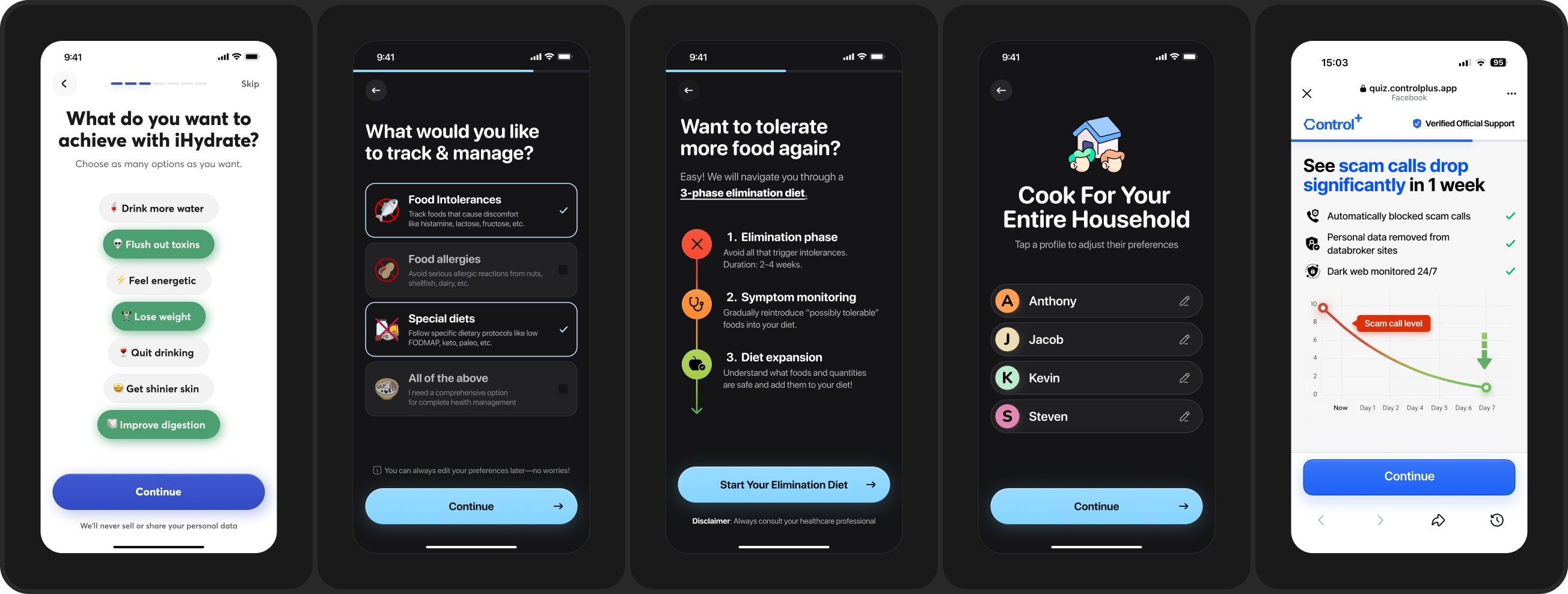
Onboarding screens to communicate how you're actually going to deliver the promise you just made.
A promise with no mechanism behind it reads as a mere claim & wishful thinking. High-converting funnels will separate the mechanism of the problem [why it is happening to them] and the mechanism of the solution [how your app fixes it].
How it looks in design: real app UI, not illustrations. Or better, let users get hands-on experience with the thing. A budgeting app can ask a user to log one recent expense inside the funnel, before they have paid anything.
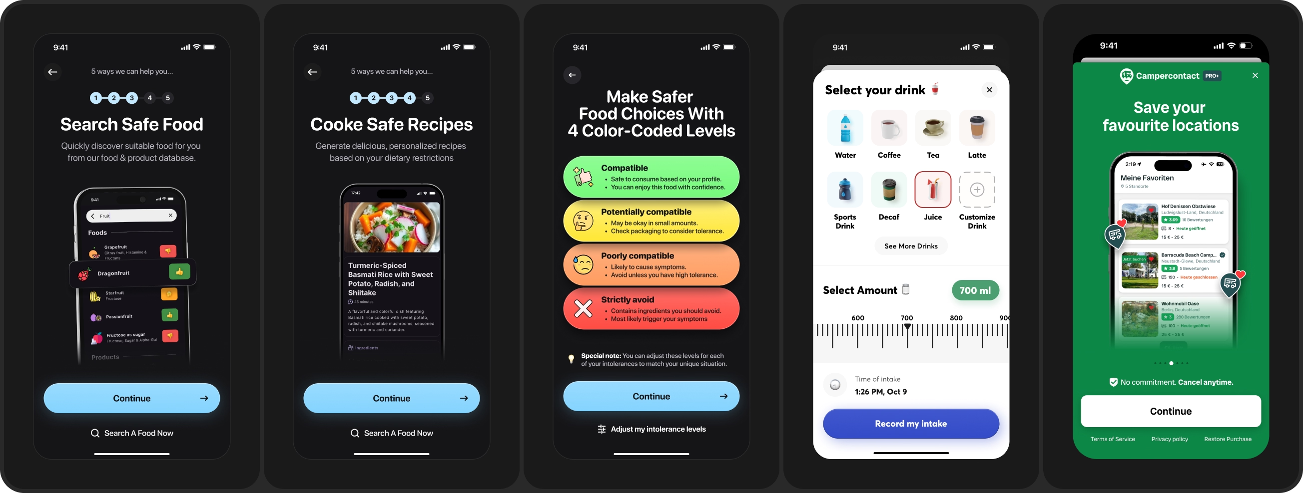
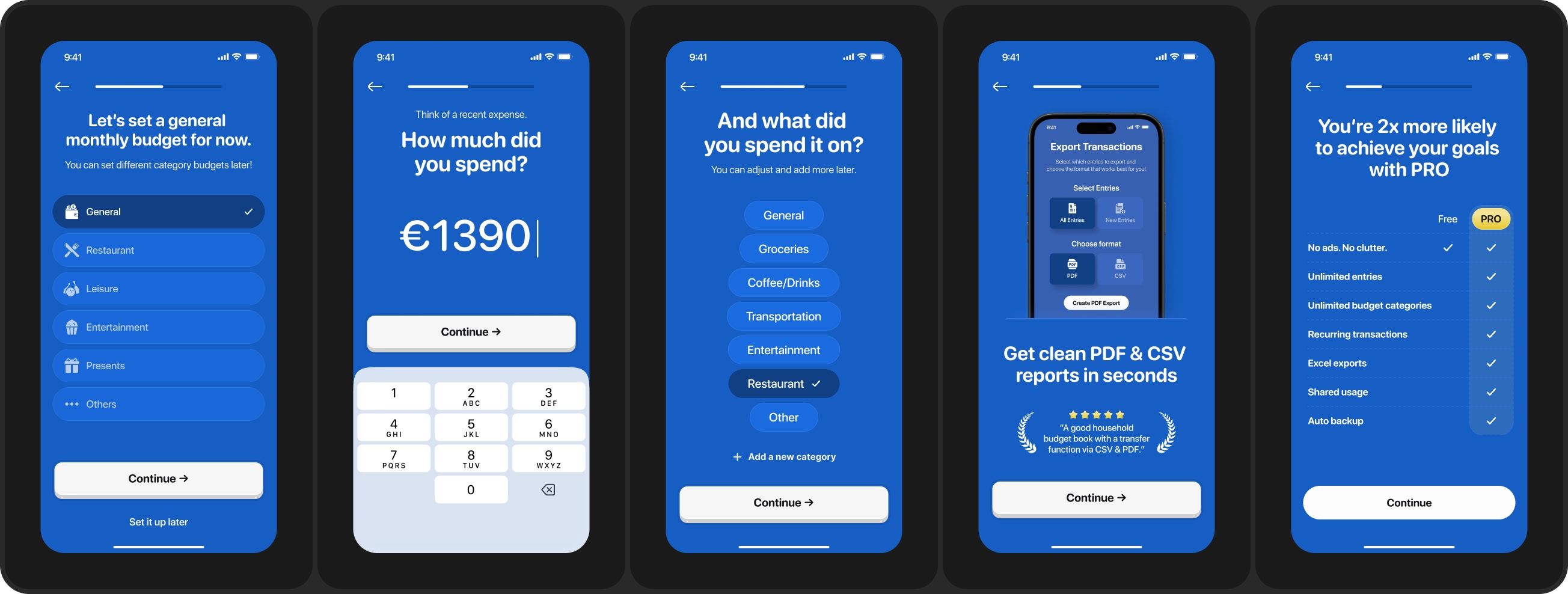
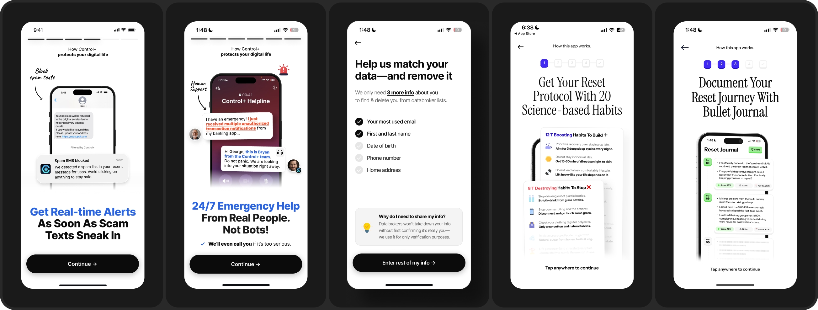
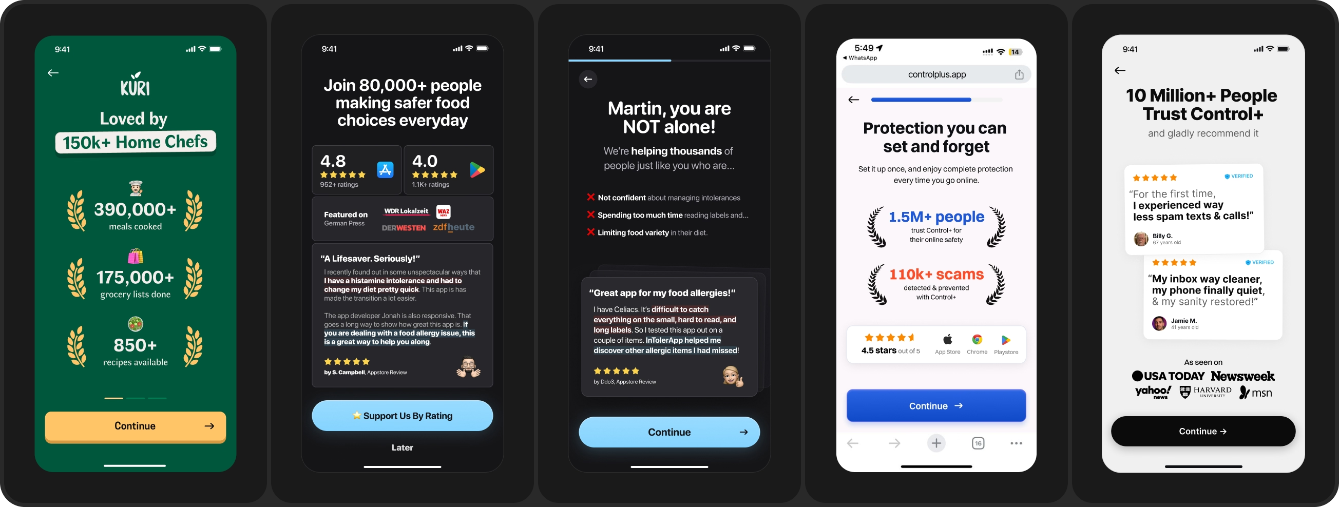
Onboarding screens that show proof that this solution mechanism has worked for others in the same boat as them. Users want to know whether this worked for someone in their situation, and they want to know it right before they get asked to pay.
How it looks in design: App Store & Play Store ratings, reviews, quotes, press logos, and the product analytics data you already have sitting in your database [eg. meals cooked, scams blocked, hours saved.]
Before, everything started in Figma and ended in code. Now it is the opposite. We start with code, then polish everything back in Figma and add our human touch.
I call it AI first design with human in the loop. Here is what that looks like:
Before AI, wireframing used to be a big part of this process. It is not any more. Now we spend most of our time on Claude.
Why we still add human touch on every screen: people can now spot AI slop from miles away. And there is a negative connotation attached to it the moment they do. I'm very careful not to ship AI slop into production and damage a client's reputation to save a day of work.
How the timelime moved: Before AI, a new onboarding funnel used to take at least 2+ weeks to prepare. Now, if you are prioritising it hard, a complete new onboarding variant can be ready to ship to production in 3 to 7 days.
Lastly, 1 recent observation: App publishers I speak to & work with seem to be more comfortable building the onboarding variant themselves in code than reaching for a no-code tool. Is this the same for you?
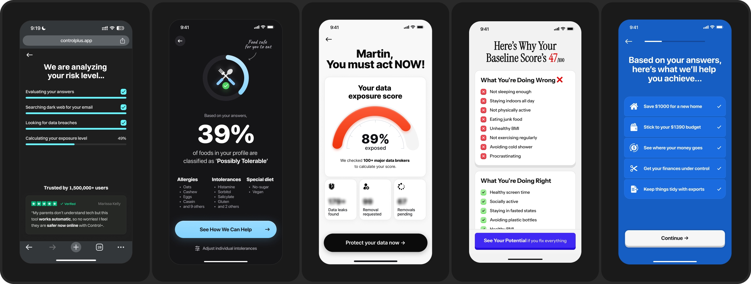
Onboarding screens that show the payoff for every question you asked. A score, a diagnosis, a plan with their own name & numbers written into it. This is the screen people are least willing to walk away from, because they helped build it. There's name for it. IKEA effect.
How it looks in design: analysis screen, percentages, score on a dial, or what you are doing wrong and right breakdown. Or a personalized plan with their inputs visible in it.
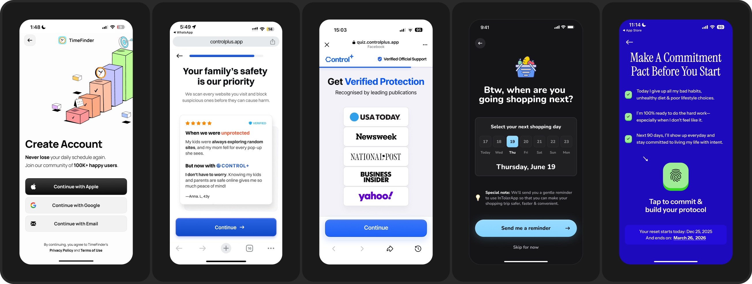
Your last stretch before the ask. Account creation, permission prompts, commitment pacts, yes-ladders, and one final social proof screen.
Note: account creation and push opt prompt almost always cost you users. But many times, they win when the motivation and trust they add is worth more than the friction they cost.
How it looks in design: A commitment pact the user taps to agree to. A reminder scheduler. Reputable press mentions. And one worth testing on almost every app: account creation after the paywall instead of before it.
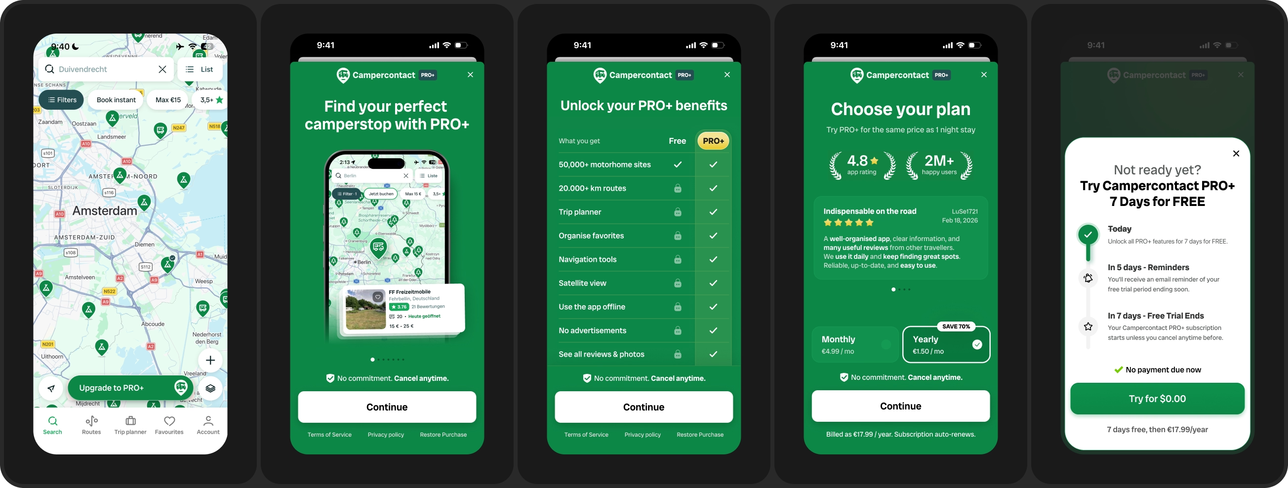
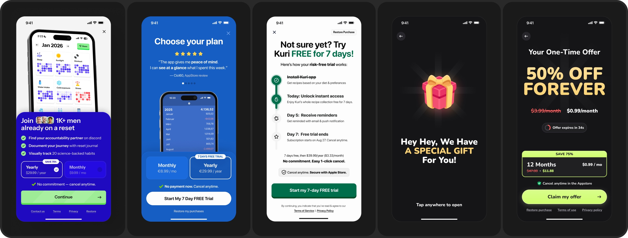
Your main ask for a trial start or direct purchase. Every pillar before this one exists to make this screen land. This is where you find out whether the journey upstream played its part well or not.
How it looks in design: Multi step paywalls, plan pickers, annotated trial timeline design pattern, exit offers & one time offers which are your second ask to a user who already told you no once.
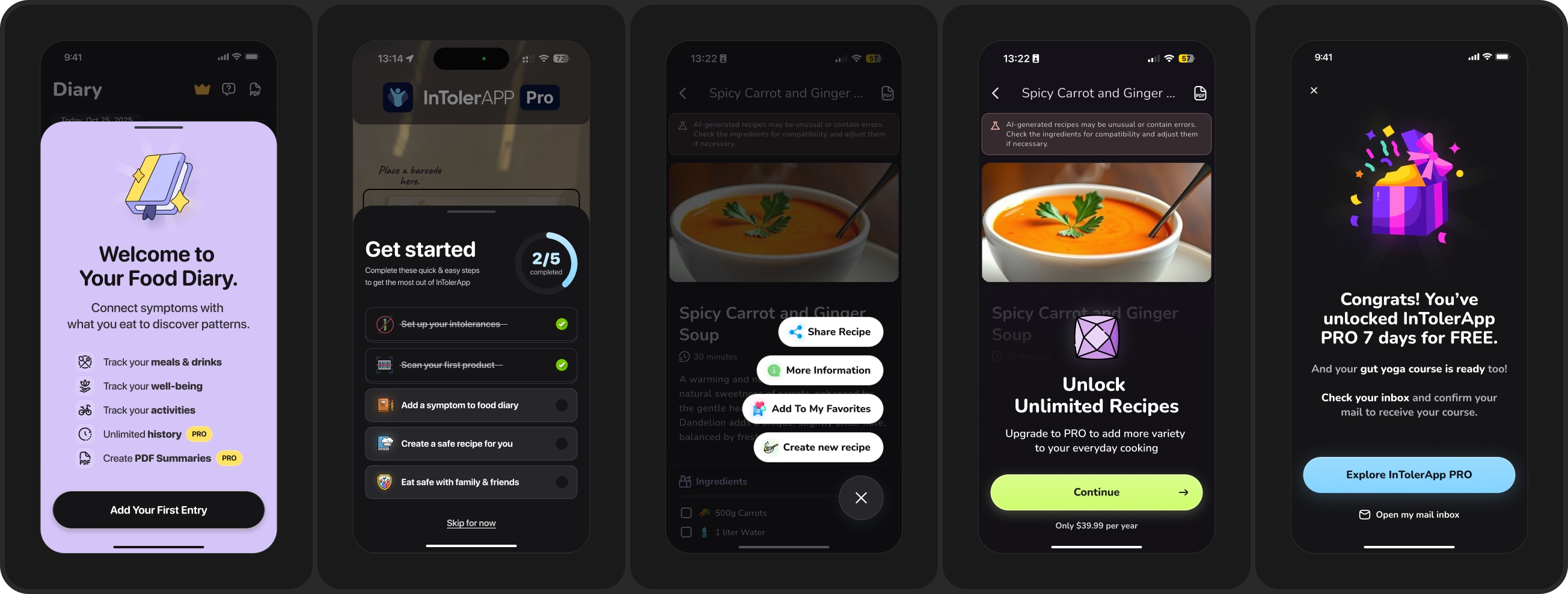
The screens a paying user sees straight after they convert. They just made an investment. The next few screens either confirm that decision or start the refund thought. A new subscriber who lands in an empty app is already thinking about cancelling.
How it looks in design: A note from the founder. A guided tour. A free 1:1 onboarding call for higher ticket products. An invite into the community. Cheap to build, but almost nobody does it.

Getting the user to complete the first core action. Not a tour of every feature. One action that delivers the exact thing they were promised on the way in. Design this from a monetization angle, not an engagement one.
How it looks in design: A first entry prompt. A short setup checklist with a progress ring so the work already started. A trial unlocked confirmation that points at the next action instead of a dead end.
There is no absolute right or wrong number, and it is not decided by what your competitors are doing. Our rule of thumb: the bigger the problem, and the closer that problem sits to a core human desire, the longer the onboarding usually needs to be.
High pain apps run long, because the funnel has to build the felt problem before the ask. Low pain apps are usually better served by a short onboarding. Ask how much work your funnel has to do, not how many screens it should have.
The 5-5-5 rule holds that three short stretches of screens decide most subscription revenue: the first five after install decide whether a user stays, the five before the first paywall decide whether they're ready to be asked, and the five after purchase decide whether they cancel.
Welcome screens, problem amplification screens, product promise screens, solution mechanism screens, proof it works screens, personalization screens, pre-paywall screens, onboarding paywall screens, post-onboarding UX screens, and core feature activation screens. Not every app needs all ten, but the order matters more than the count.
Before AI, it used to take at least 2-4 weeks. Now, if you are prioritising it hard, a complete new onboarding variant can be ready to ship to production in 3 to 7 days.
We build a working prototype of the funnel in HTML first, lock the content, polish it back in Figma, then hand off to your developers or build it in a no-code onboarding builder. Reading the result takes longer than building it, because we hold tests to the full trial-to-paid window rather than calling them on day-0 conversion.
Yes. I call it AI first design with human in the loop. Before, everything started in Figma and ended in code. Now it is the opposite: we start with code, using tools like Mobbin MCP and Claude Code to build a working prototype of the screen funnel in HTML, then polish it back in Figma and add our human touch. Wireframing used to be a big part of the process. It is not any more.
Because people can recognise when something was built by AI, and there is a negative connotation attached to it the moment they do. A funnel that looks generated undermines trust at exactly the moment you are asking someone for a payment, and that damage carries into how they see your brand long after the test ends.
We are very careful not to ship AI slop into production and damage a client's reputation to save a day of work. AI is a speed tool inside our process. It is not the process.
From a voice of customer worksheet we build for your app before any design work starts. It is the knowledge base we work from. We mine app user reviews from the App Store and other sources, plus surveys, feature requests and support tickets, and we write the entire onboarding from that. Nobody on the team writes an onboarding screen from imagination.
Depending on traffic, at least 2 onboarding iterations or more, alongside 4+ paywall design experiments, all working from a RICE-prioritised roadmap. The cadence matters more than any single redesign. A one-off onboarding overhaul gives you one data point. A monthly cadence compounds.
Completion rate is a proxy. Useful for diagnosis, wrong as a primary. Proceeds per user is our primary on onboarding tests, with install-to-paid, trial start rate and trial-to-paid as the numbers that map to revenue. We want screen by screen funnel reports in Mixpanel or Amplitude, not a single onboarding completion number, and we read conversion by segment: age, job to be done, acquisition source, and the problem the user came in with.
The audit is free. Submit your app here and I will come back with where your funnel is losing subscription revenue and what we would test first.
If you want to go deeper straight away, book a 1:1 advisory engagement..
Ongoing engagement runs as a monthly Paywall, Monetization & Onboarding CRO Program at $7,000 to $15,000 per month depending on scope and volume, and a standalone paywall A/B test starts at $1,000. Every plan is month to month, with no lock-in.
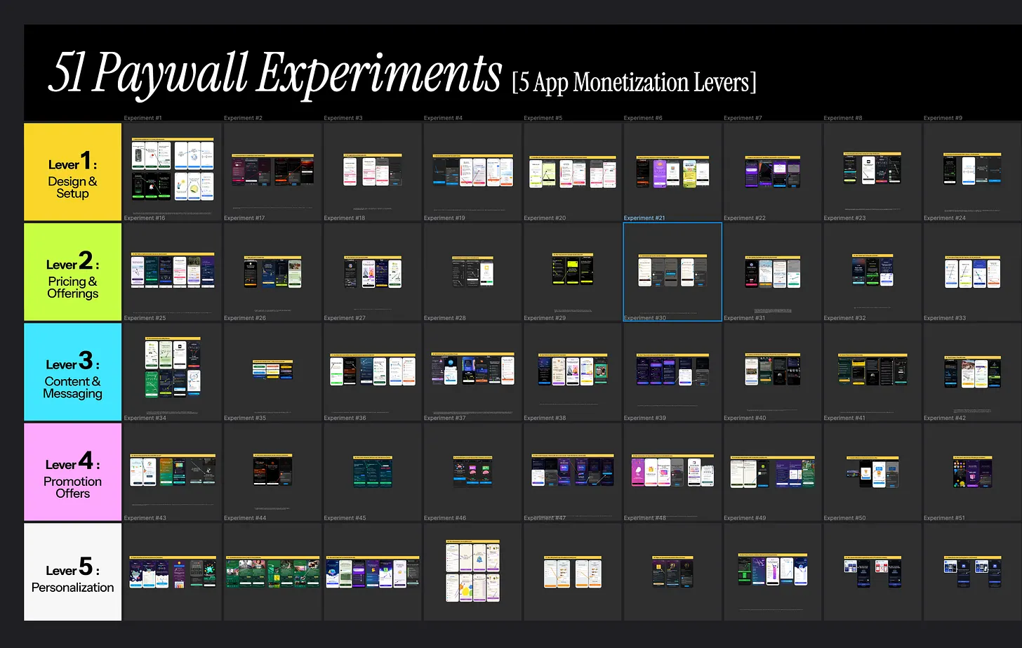
Image:Paywall experiments library by Muhammad Rahat
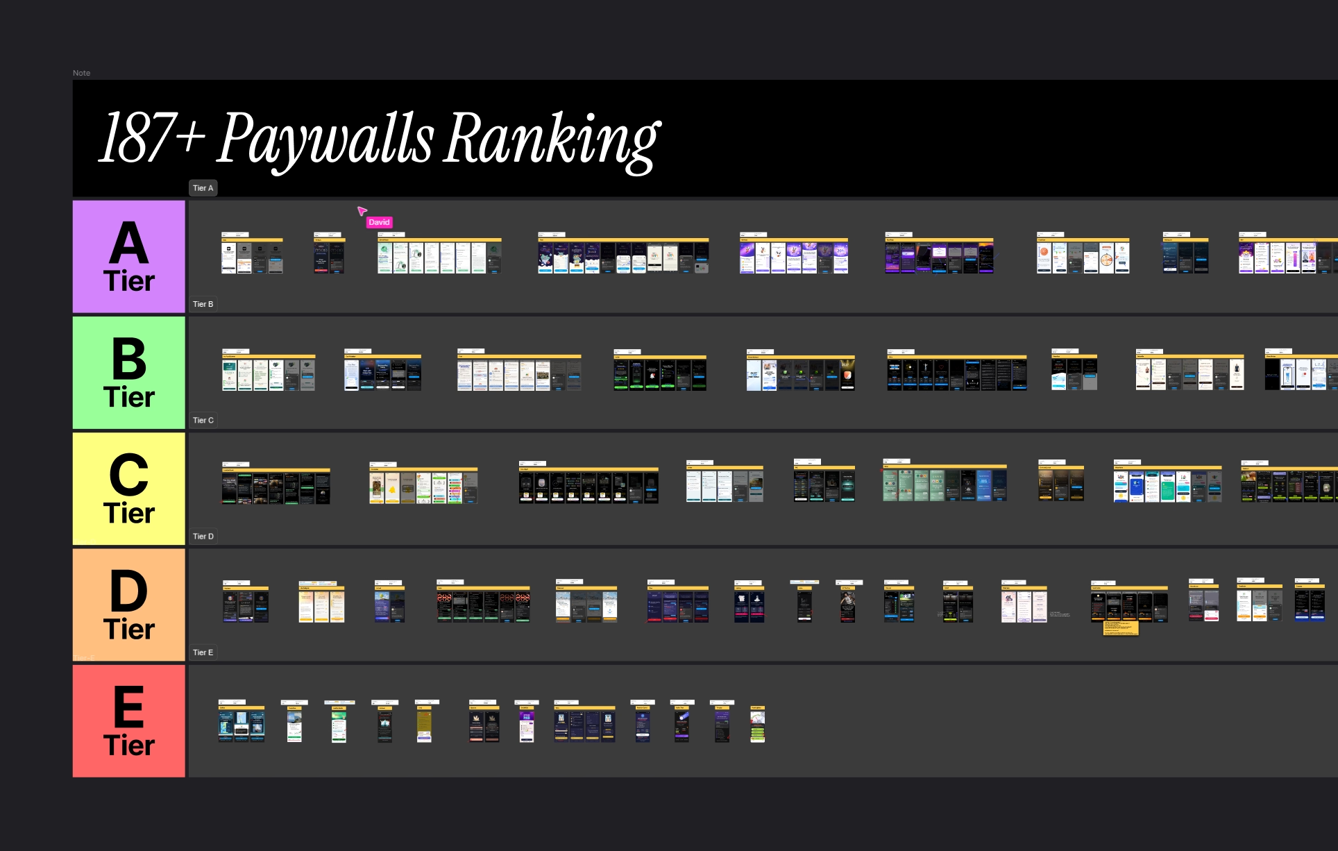
Image:Paywall examples from Roastmyapp's swipe file
Start with a free CRO audit of your app where we schedule a 30-minute coffee chat on Google Meet to go through your mobile app's current paywall & onboarding setup together. I try to do this review for 5 apps completely FREE every month.
By the end, people walk away knowing their 3 biggest blockers costing them real money. if I think my app monetization & CRO program isn't a good fit for your app, I'll tell you that too.
Find more about Roastmyapp's mobile app monetization & CRO framework here →
Best,
Muhammad Rahat
Founder @ Roast My App LLC