![51 paywall experiments [with examples] Figma board](https://cdn.prod.website-files.com/65ba19a5d4e4d1b2bbc3ee31/6a71af2d5eb9bd0043d20dcd_1.avif)
Image: Roastmyapp's paywall swipe file in Figma

Image:Linkedin post analytics screenshot
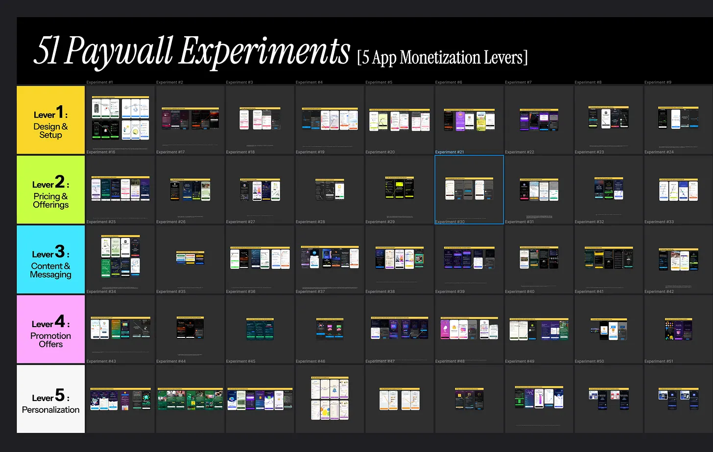
Image: 51 paywall experiments across 5 monetization levers
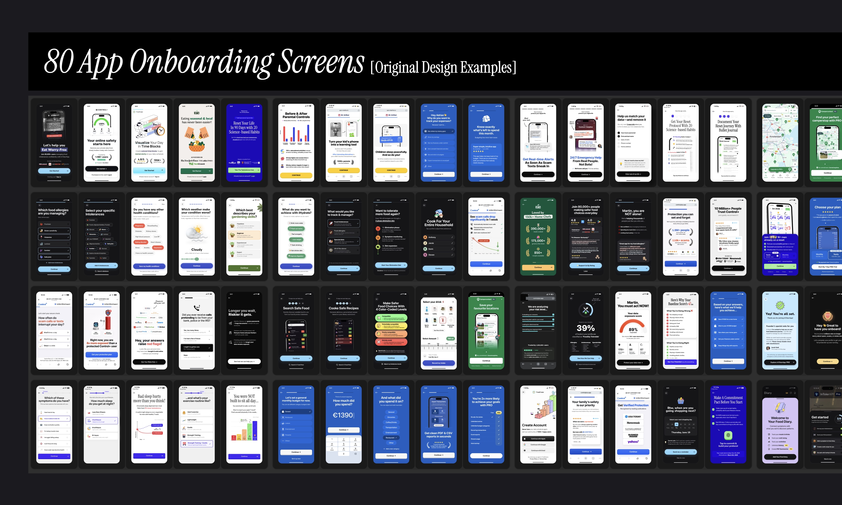
Image: 80 mobile app onboarding screens—original design examples
Backstory: if you work with mobile apps, I bet your gallery is filled with screenshots you “saved for later”, but never really revisited them even once in your life. I do paywall & onboarding optimization for a living, so you can imagine how messy my photos app can get. I needed to give my screenshots album a proper home. So here we are.
What this means: every single screen you’ll see here is not taken from UI libraries like Mobbin or Screensdesign. These are all apps I've downloaded for real & went through myself. I started trials for at least half of these apps [and cancelled them for obvious reasons, a.k.a. $3K+ in subscription bills].

Image:Strava app's onboarding paywall & app2web checkout flow
The apps were also not picked at random. Most of them are teams I'm connected with on LinkedIn. Top-grossing apps from various categories that I closely keep an eye on. And multiple apps I have worked with directly.
This paywall ranking exercise is definitely not intended to put down any team’s effort. I chose this format in particular because you could make a tangible distinction between what converts & what doesn’t. Think of it like a spectrum from “thing you should probably test on your paywall” vs. “pitfalls to absolutely avoid on your paywall”.
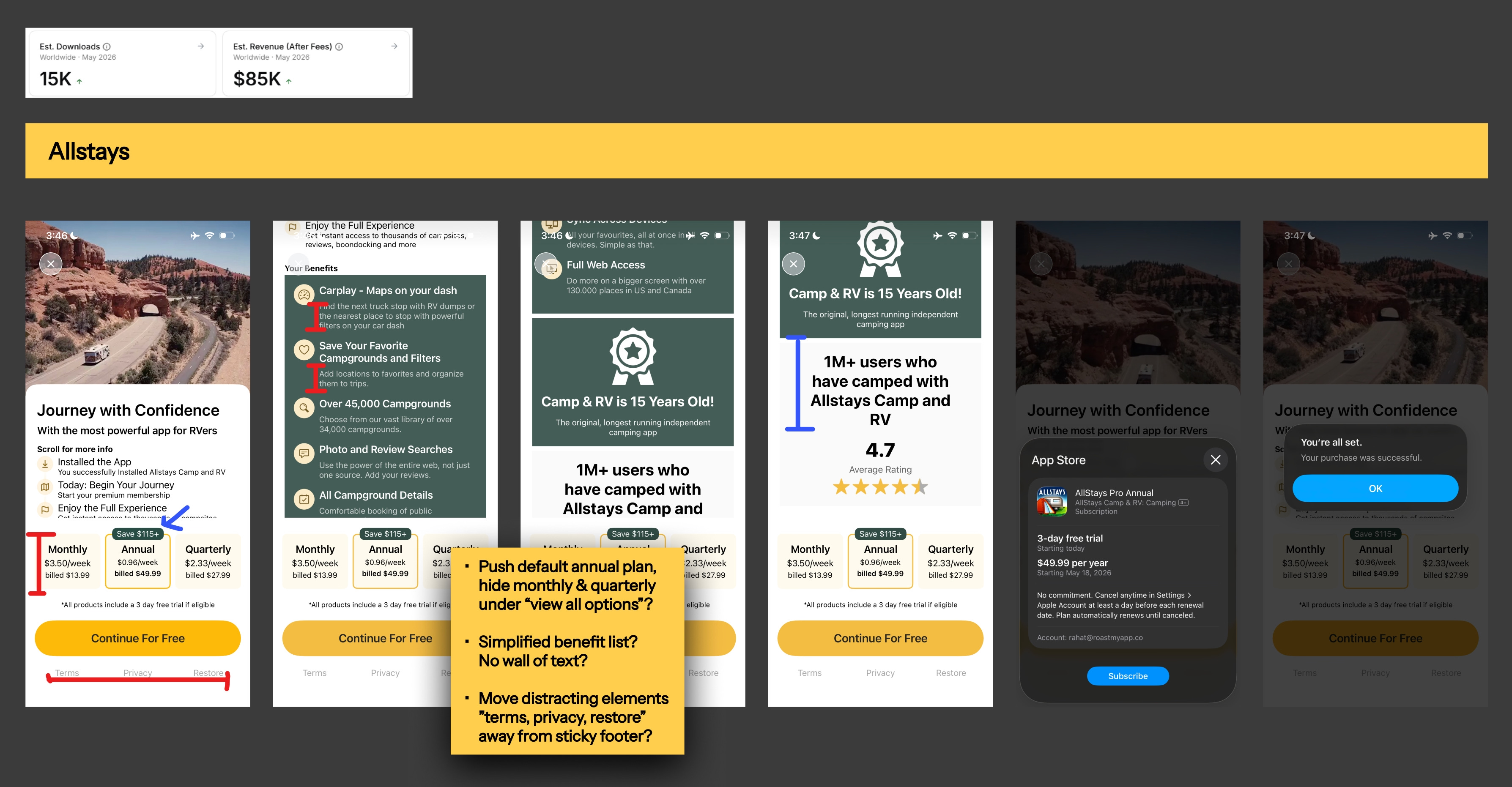
Image:Allstays camping app's single-screen paywall design
I’ve analysed, designed & shipped enough paywalls over the years [no flex] to instinctively differentiate between a high-converting paywall setup vs. a not-so-high-converting paywall setup. Of course, this is not a complete black-and-white situation. True numbers under the hood could tell a very different story. But it was a fun & educational exercise nonetheless.
If you’re also wondering whether this ranking is based solely on monthly revenue estimates, it is NOT. You’ll find loads of examples of apps printing money, making it to the bottom tier. And I think that’s the beauty of it.
Your app can do perfectly fine, even if you have the ugliest paywall in the world. And your app can still struggle, even if you are using a “high-converting paywall” template from tools like Superwall or RevenueCat. My goal as a growth practitioner is to tell you exactly why this happens…
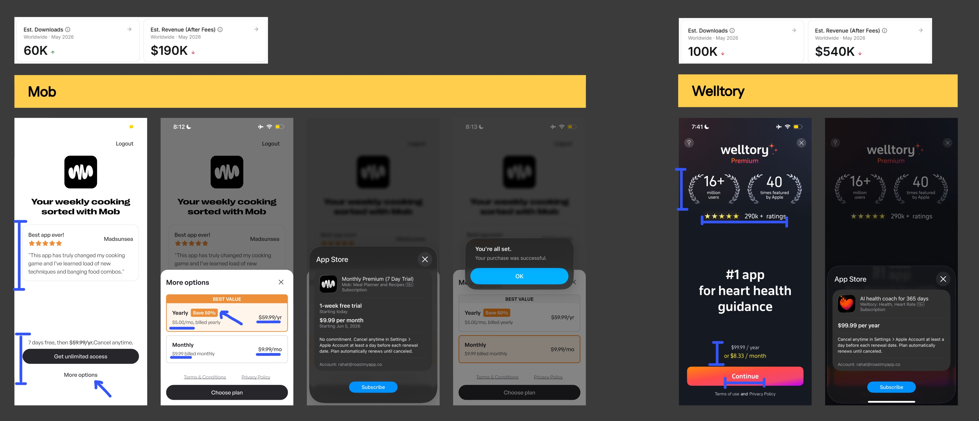
Image:Social-proof-focused minimal paywall design examples
Note: All revenue & download estimates are taken mostly from Appfigures & Appmagic.
The worst way of using resources like these would be simply copying what top-grossing apps & your competitors are doing. The problem with this approach is that you unknowingly pull the wrong growth levers first and, in most cases, end up seeing no meaningful uplift in your trial-start or trial-to-paid conversion rates.
Here’s what NOT to do: Copy [without brains] what you see on top-tier paywalls, and pray your app converts better.
Here’s what to do instead: recognise the underlying principles, cognitive biases & priming tactics behind the design patterns I’ve marked with the pencil tool. [For simplicity, blue line = good, red line = bad].
Definitely look into what’s happening upstream of a particular setup you like. And only then, build your paywall solution around it.
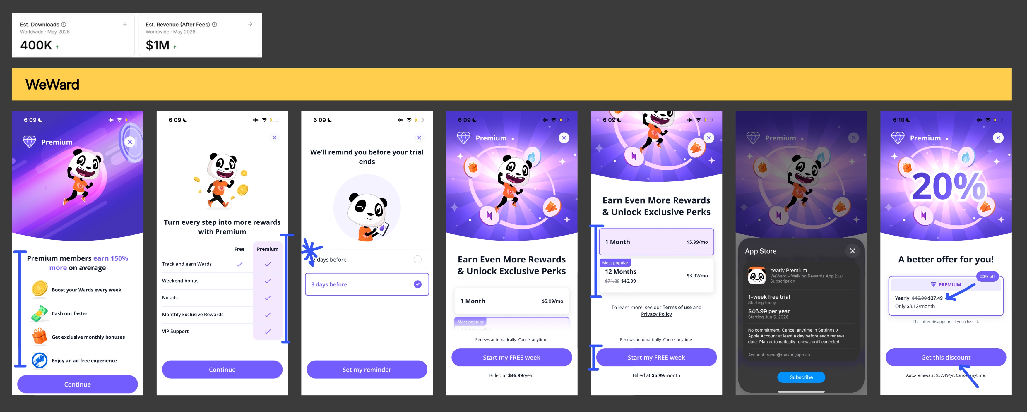
Image: Multi-step paywall design by WeWard step tracker app

Example #1: Yuno multi-step paywall
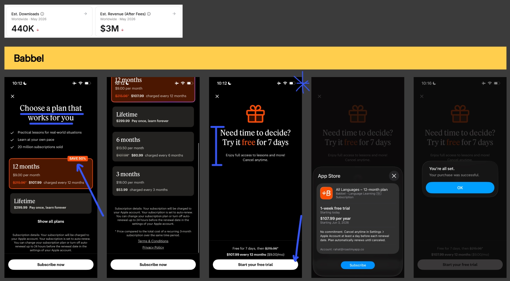
Example #2: Babbel language learning app
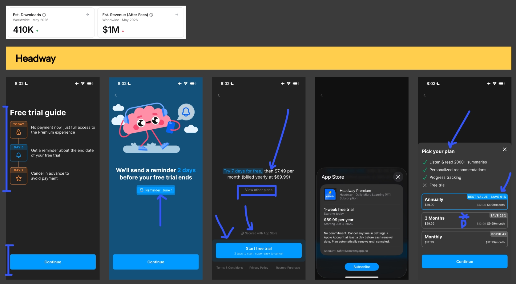
Example #3: Headway's free trial multi-step paywall
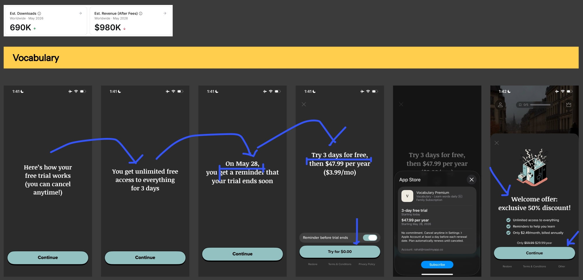
Example #4: Vocabulary app's bare-minimum text-only paywall

Example #5: AllTrails single-screen paywall

Example #6: Duolingo's animated multi-step paywall

Example #7: Cal AI paywall
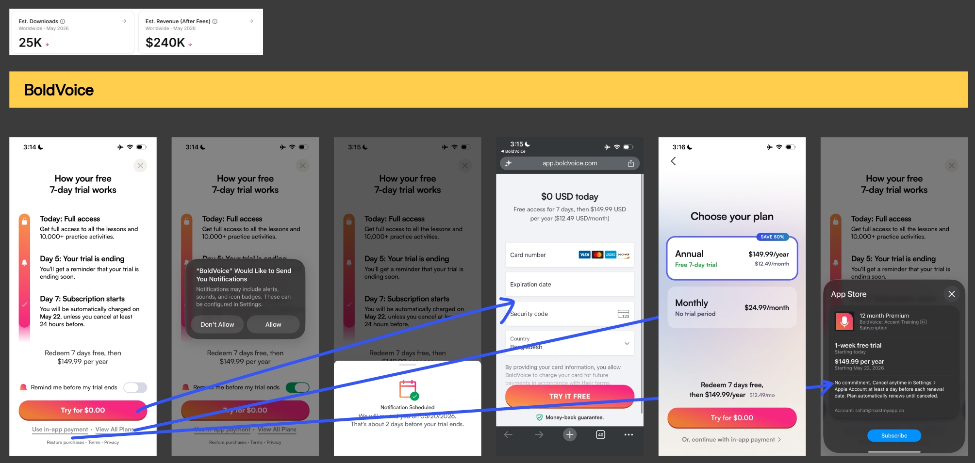
Example #8: BoldVoice App2web checkout
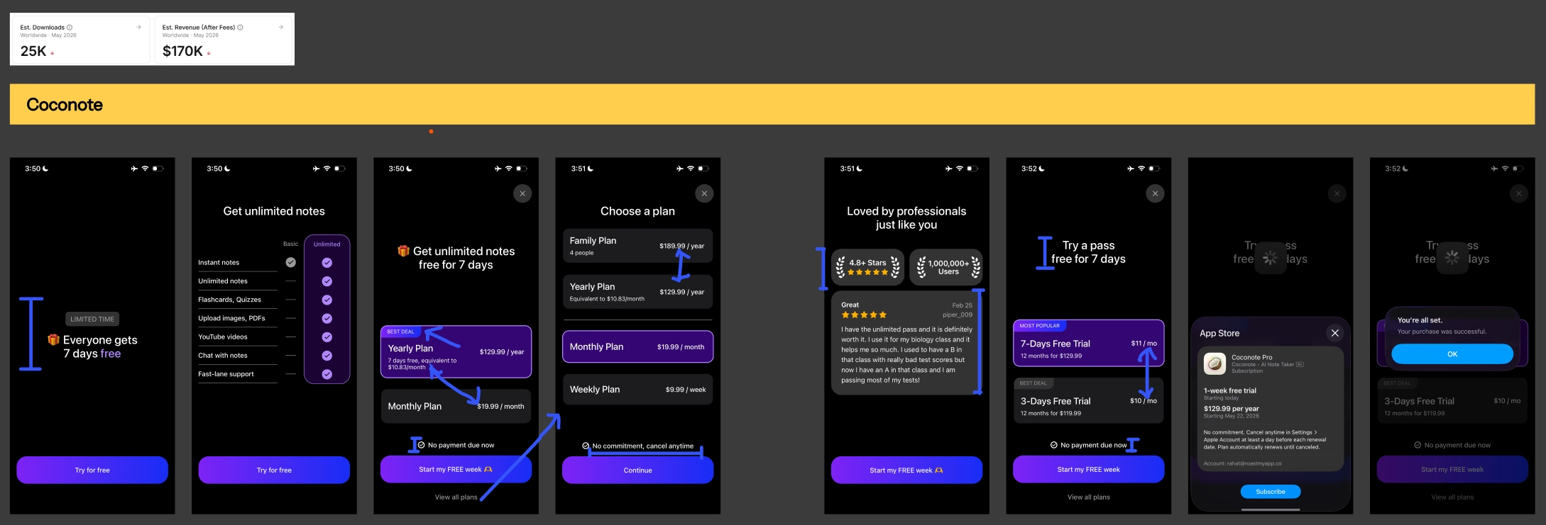
Example #9: Coconote's monetization setup
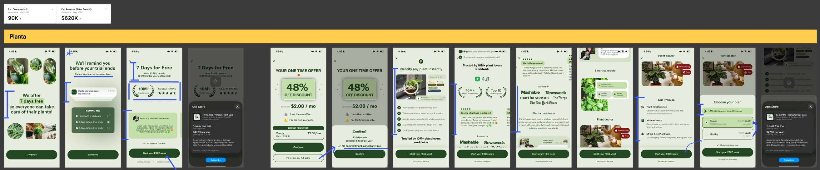
Example #10: Planta app's monetization setup

Example #11: Flo's app2web + post-purchase UX

Example #12: Gravl app's monetization setup

Example #13: Quittr app's monetization setup

Example #14: Kinedu's multi-step paywall
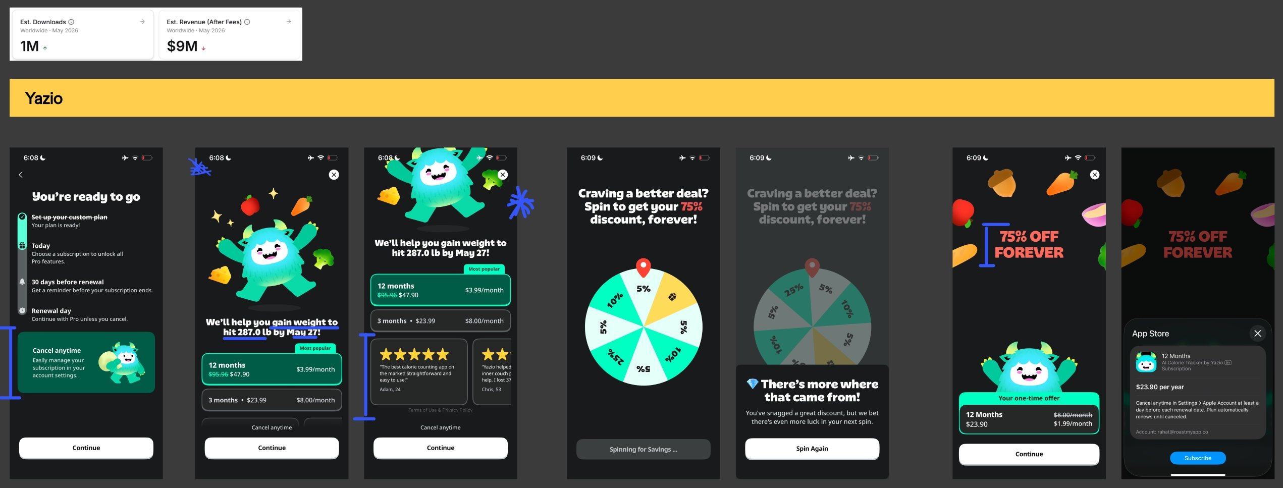
Example #15: Yazio's paywall with personalized headline

Example #16: BetterMe's upsell offer

Example #17: Breeze paywall with animated CTA button
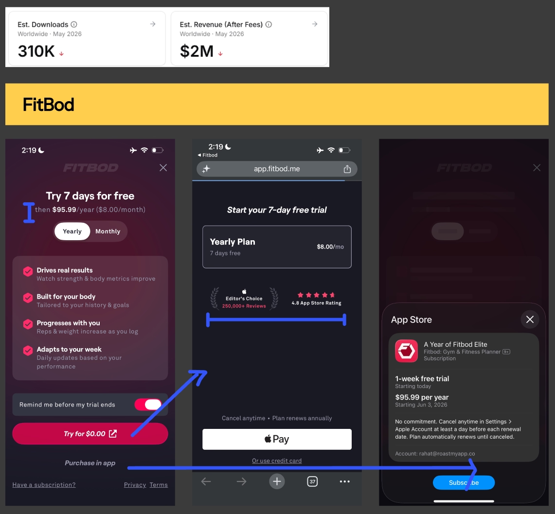
Example #18: Fitbod's compliant app2web checkout

Example #19: Brainrot app's monetization setup

Example #20: Lock in app's monetization setup

Example #21: Tolan app's personalized paywall setup
I’m taking all my learnings from this ranking exercise and turning them into an actionable list of paywall a/b test ideas for you to add to your backlog. Here are a couple of examples that I posted on LinkedIn already.

Image: Pricing & packaging paywall a/b test idea

Image: Paywall design a/b test idea with "see all plans" button
A high-converting paywall gets the pricing, trial structure, layout, copy, placement and personalization decisions right together, not any single one of them in isolation. In practice the biggest gains usually come from pricing and packaging and from trial mechanics rather than visual design. A visually beautiful paywall with a weak price anchor will underperform a plain paywall with a strong one.
Not solely on revenue. The ranking is based on the quality of the monetization setup. This includes pricing and packaging, trial structure, layout, messaging, placement and personalization. That's why plenty of apps printing serious money still landed in the bottom tiers, and smaller apps landed at the top.
Copying what others are doing usually backfires, because the users arriving at your paywall come from different channels, demographics and levels of intent than the users arriving at theirs. Copy the underlying principle a.k.a the anchor, the cognitive bias, the priming tactic. You can then rebuild & tailor the paywall solution around your own funnel.
Multi-step paywalls are increasingly becoming the norm, especially for health and education apps, because people can only process five to seven pieces of information at a time. If you're currently on a single scrollable screen showing everything at once, testing a multi-step structure is usually one of the highest-impact experiment you can run.
Low-commitment copy generally outperforms high-commitment copy. "Continue," "Try it free," "Try for $0.00" and "Start my 7-day free trial" tend to beat "Subscribe," "Subscribe now" and "Buy." Apple's native purchase sheet already says "Subscribe," so using it on your button repeats a high-friction word twice in a row.
The ones that showed up most in the bottom tiers: only one pricing product with no anchor, plans priced too close together, a CTA button that's hard to find, too many exit paths, a cluttered sticky footer, disclaimers used as button copy, walls of text, outdated Apple badges, and assets that visibly look AI-generated.
Mature-stage subscription app companies typically run at least 1 experiment 7 days. The exact cadence matters less than continuity. Teams that test continuously compound their learnings, while teams that ship once and move on stop improving entirely.
Start with a free CRO audit of your app where we schedule a 30-minute coffee chat on Google Meet to go through your mobile app's current paywall & onboarding setup together. No pitch deck, no strings attached.
By the end, you walk away knowing the 3 biggest blockers costing you real money. if we think our monetization & CRO program isn't a good fit for your app, we'll tell you that too.
Find more about Roastmyapp's mobile app monetization & CRO framework here →
Best,
Muhammad Rahat
Founder @ Roast My App LLC