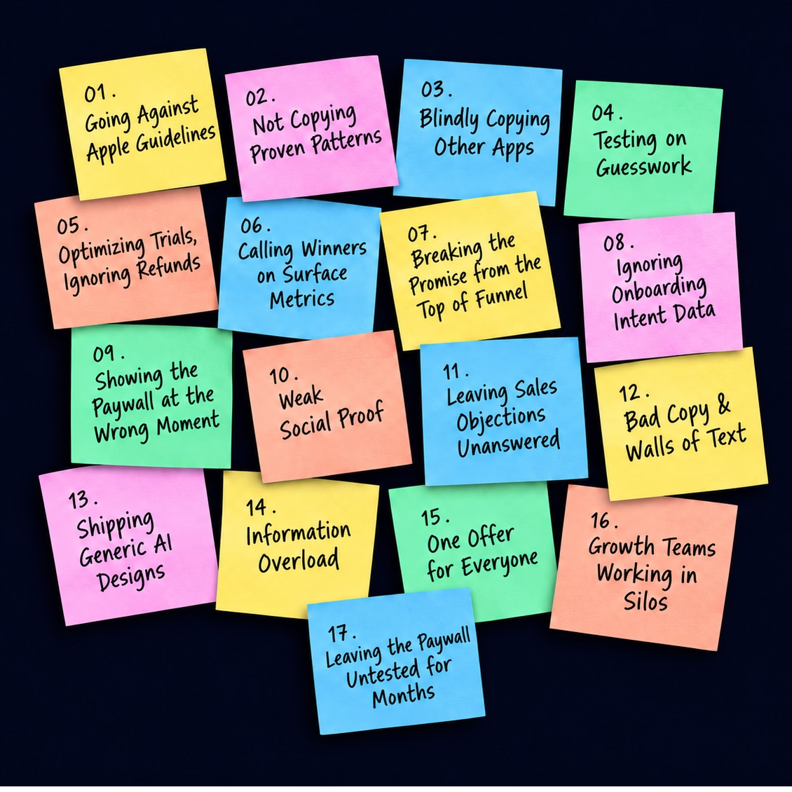
Image: 17 paywall optimization mistakes in a nutshell
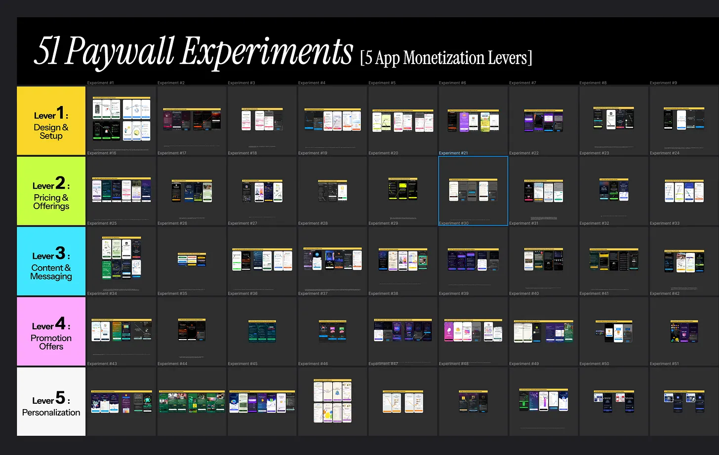
Image:Paywall experiments library by Muhammad Rahat
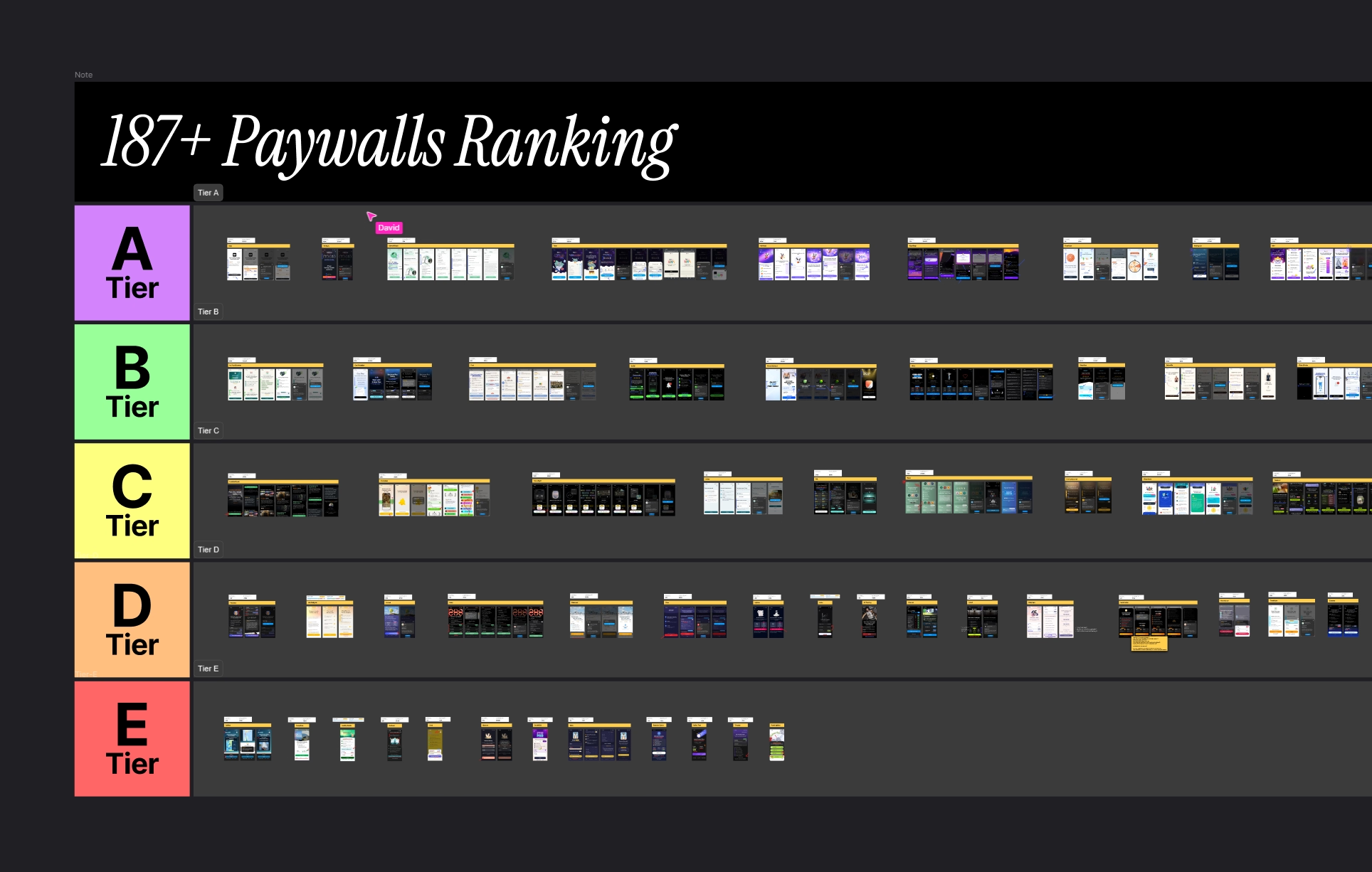
Image:Paywall examples from Roastmyapp's swipe file
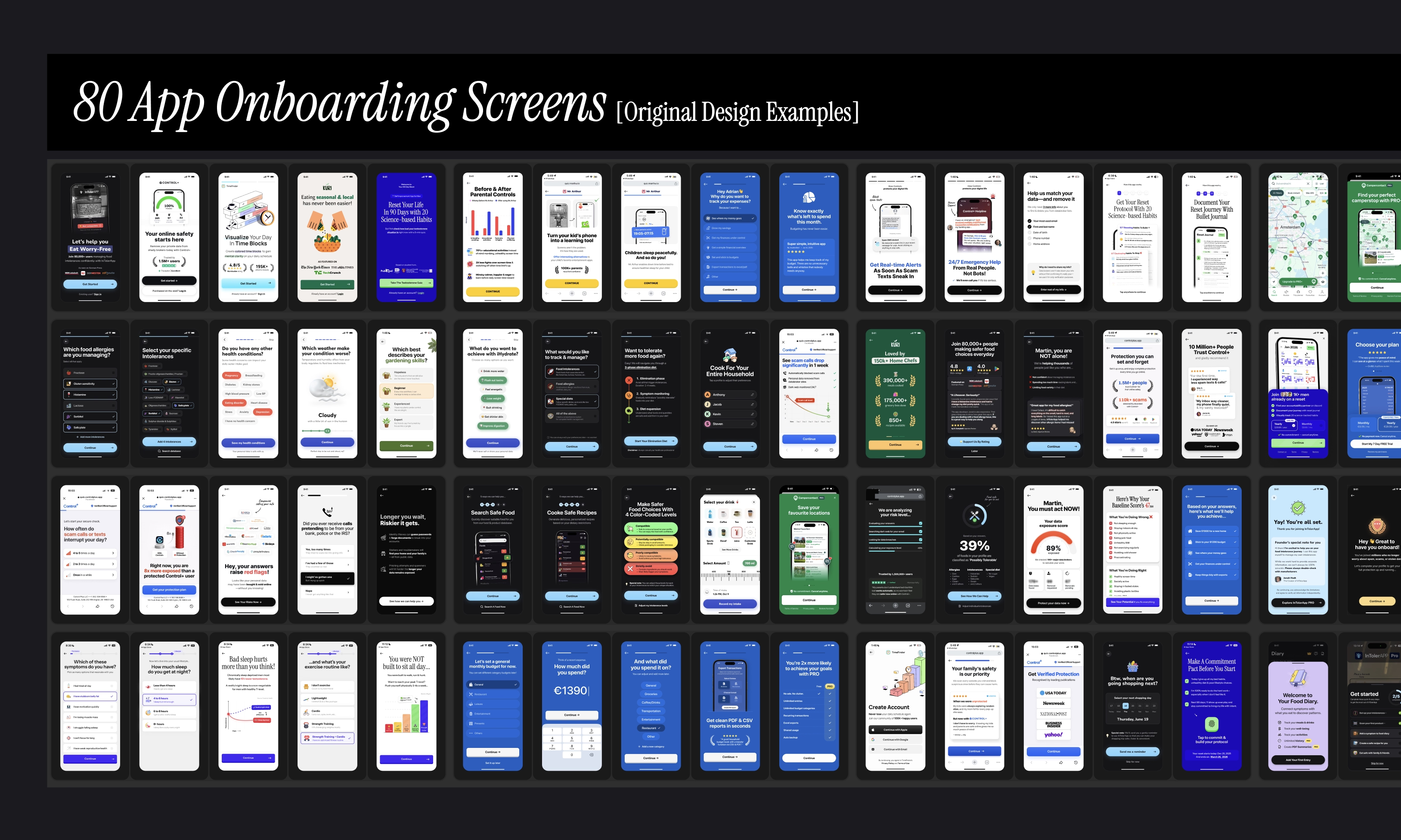
Image:App onboarding screens design by roastmyapp
If you're on X, you've surely watched this one play out too many times in 2026. Here are a few examples...
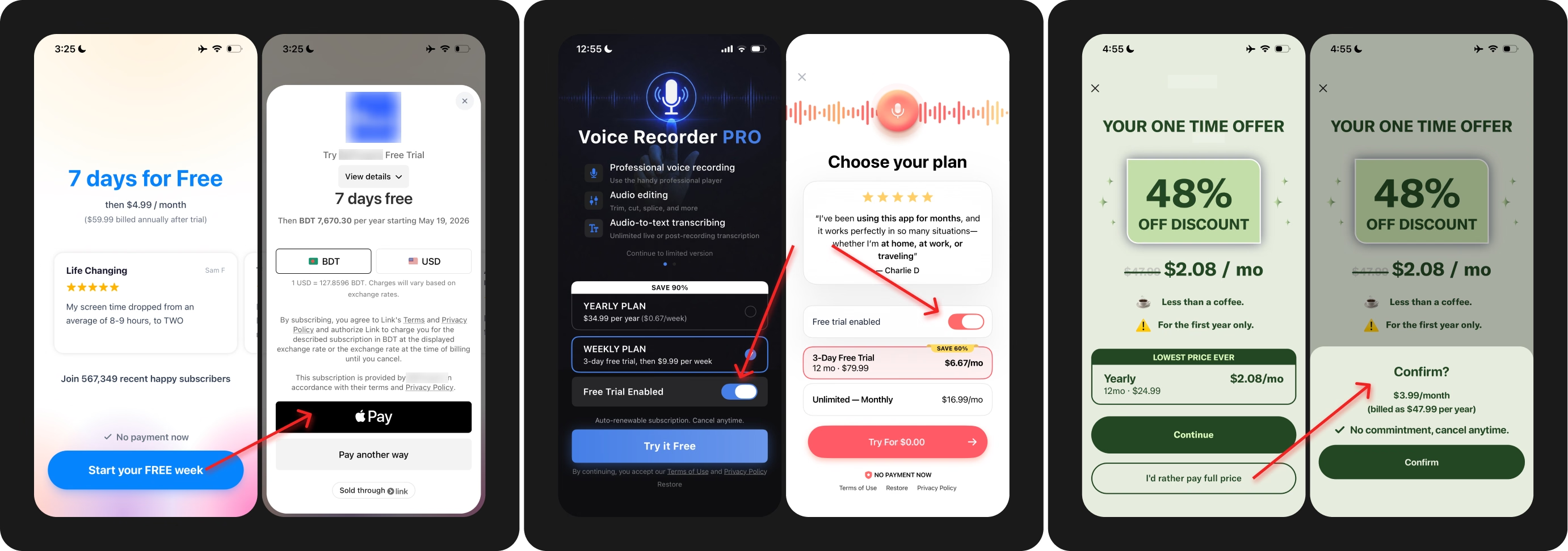
Image: Examples of non-compliant app2web checkout, trial toggle button, and confusing paywall exit offer.
Even after all this, I still find apps consciously shipping patterns knowing Apple won't approve it during a rigorous review process.
Remote config & tools like Superwall allows you to change paywall content without a new release. Misusing them feels like a quick money-grab . But if you think, you'll always get away with shipping misleading or deceptive pattern without Apple noticing. I've got bad news, my friend.
Questionable hacks & black-hat hacks may lift conversion in the short term. But then they come back to haunt you in the most unexpected time.
Potential fix → Avoid "growth at any cost" mindset. Ship the compliant version, even if your numbers dip. Play the long game. Getting your app removed from the appstore, or payouts paused due to high refund rate, is the last thing you'd want for a sustainable revenue growth.
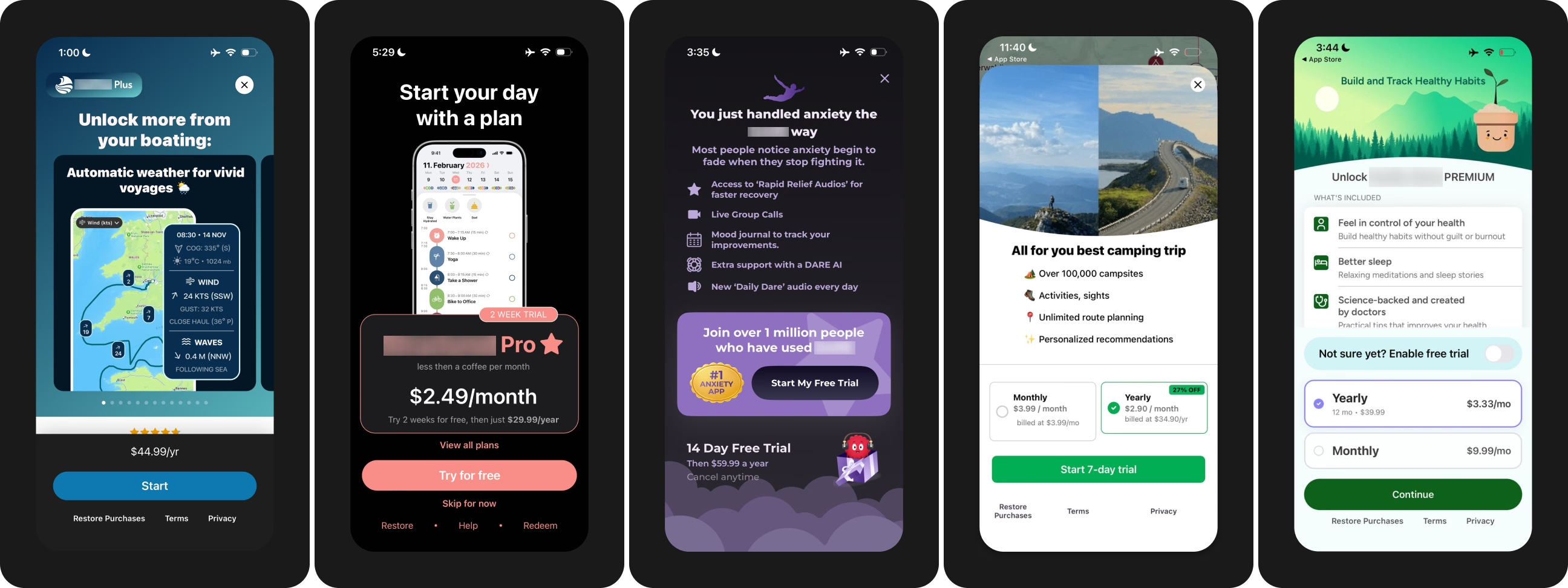
Image: Paywall examples that do not follow proven design patterns
Your users arrive with a mental model built from every app they ever paid for. Breaking the model confuses people at the exact moment they were about to pay. Here's how it usually happens...
You work with UX/UI designers who've never seen data from real paywall experiments. Or you build with AI without giving it context & references from high-converting paywalls. Either way, you end up shipping paywalls that look original, but convert poorly.
Without real data on what converts, reinventing proven paywall UI design patterns is an easy mistake to make.
Potential fix → Study how top-grossing apps design their paywalls before you design yours. Learn the psychology behind why certain patterns work, like the trial timeline lifting trial start rates. I ranked 187+ paywalls into top & bottom tiers for exactly this reason. You can find them here →
This is the part where I add a disclaimer to mistake #2. Copying works, up to a point. But you hit a wall if done blindly, without checking relevance.
This is common practice in the mobile app industry, where everyone's basically copying one another, and shipping clones with AI.
I believe here's a workflow we've all been guilty of at least once:
Find an app making $4M a month. Screenshot the paywall. Rebuild & ship. Then watch the new paywall perform no better than the one you already had. The needle didn't move because we copied the finish line of experiments we never ran.
Potential fix → Before you borrow a pattern, write down what the pattern depends on. Here are 5 things I check before borrowing a paywall from another app for my own A/B test…
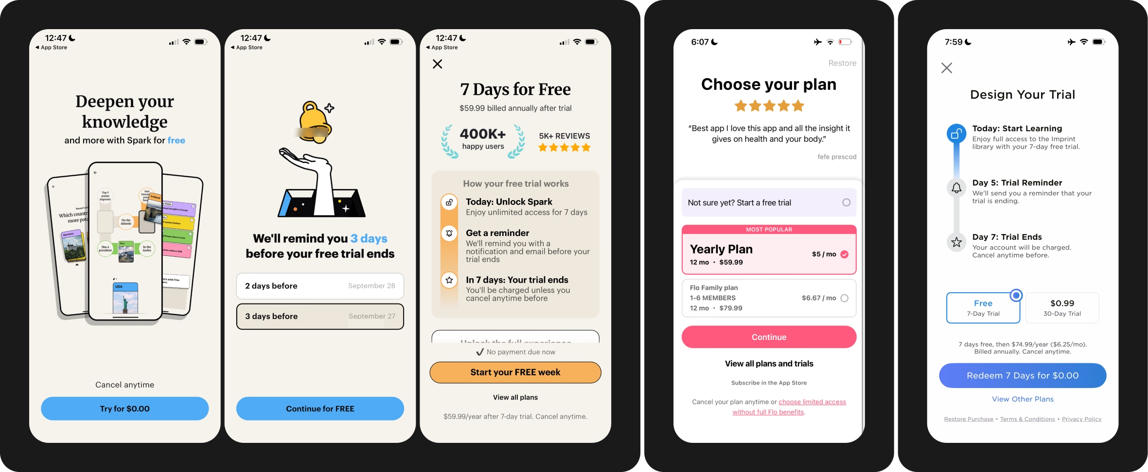
Image: High-converting, stress-tested paywall examples
Most app teams build & iterate paywalls in a vacuum—without looking into customer data from surveys, user interviews, AppStore reviews & support tickets. They burn weeks of traffic by testing solely on intuition & guesswork.
If you are guilty of this, I guarantee, you're sitting on a gold mine of monetization insights right now. For example, here are 3 ways to bring data into your testing discipline...
Potential fix → At Roast My App, we write every test hypothesis in this format: Problem [based on what your data point towards] → Solution hypothesis [If we change X, Y moves, because Z] → Primary metric → Guardrail metric.
Start simple with 3 research streams: Paywall exit & trial cancellation survey, monthly pass through 1-star reviews & support tickets, and 2+ user interviews a week.
Feed the transcripts to Claude, and your next monetization experiments will find you without you even looking.
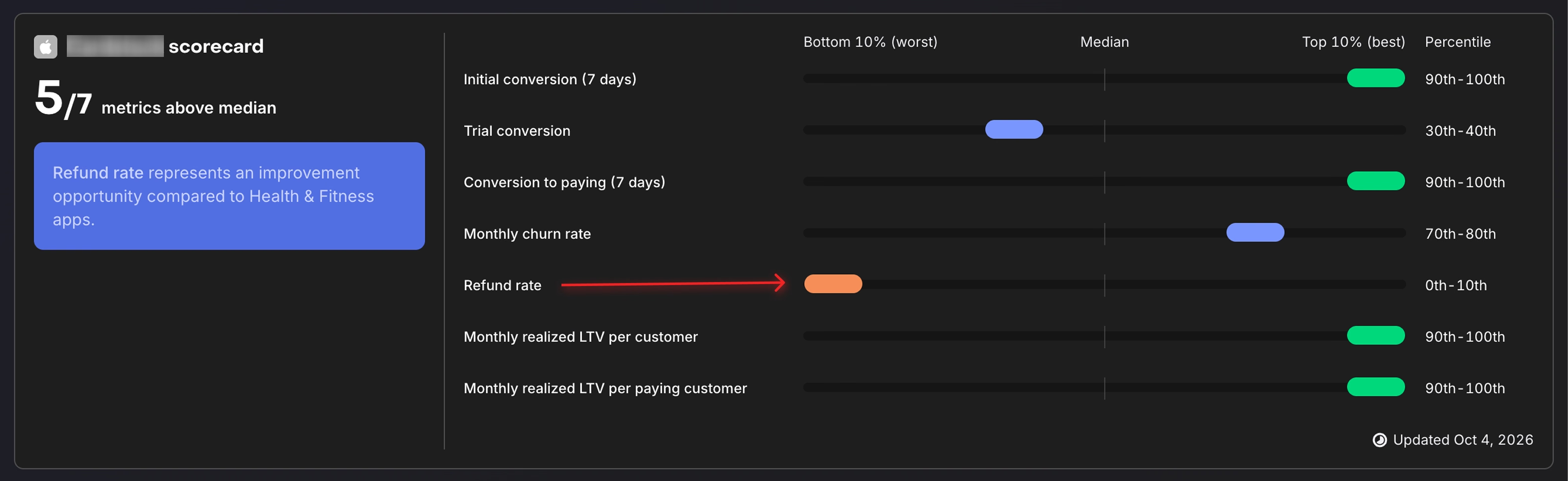
Image: RevenueCat benchmarks dashboard of a Roastmyapp customer
You most likely have a product problem [and not a paywall problem] when a significant number of people start a trial, but cancel immediately or request refunds later.
One tactic to push your trial starts up is a hard paywall after a long onboarding. But anything that forces or tricks people into starting a trial, you'll pay for with refunds down the line.
Once you check failed payments & refunds, the bottom-line gain won't be that big, and sometimes even negative.
When the product doesn't deliver the value you promised in the onboarding or ad creatives, people cancel right away or ask for a refund later. Additional downside: you'll also rack up negative reviews fast from your refunded users.
Potential fix → Do optimize the paywall. But don't over-optimize the paywall compared to the actual product value you're delivering to your users. Shift your focus to the first session & day 2 to week 1 retention.
Trial-to-paid below 20% or a refund rate above 10% is a signal your core product needs more work, instead of another paywall test.
At the end of the day, make a better product for people. That's how you drive more long-term revenue that actually renews.
Imagine this. Your paywall test variant wins on trial start rate with statistical significance. You roll the variant out to 100% of users. But a month later, you don't see your revenue move at all. Sounds familiar?
Trial start rate is the easiest number to move & the first one to hit significance [most of your users sit at the top of the funnel]. Renewals, failed payments & refunds decide your revenue weeks later. A clear win on day 3 may turn into a loss by day 30.
Potential fix → Judge every test on net revenue after refunds, per exposed user, on a matured cohort. Here are 4 rules to follow...
This is commonly seen across mobile app teams scaling with paid ads. Your meta ad creatives promised a personalized plan. But your paid traffic do NOT find anything personalized after completing the onboarding. Maybe just a generic tour of app features waiting to be unlocked.
By the time users reach the paywall, the intent your ad created is gone. Promise gaps hit hardest on paid traffic & web funnels, where users don't know you yet & their intent is fragile.
This is not easy to take care of now that AI has sped up creative production. Marketing team can test many different angles & it's hard to keep with them.
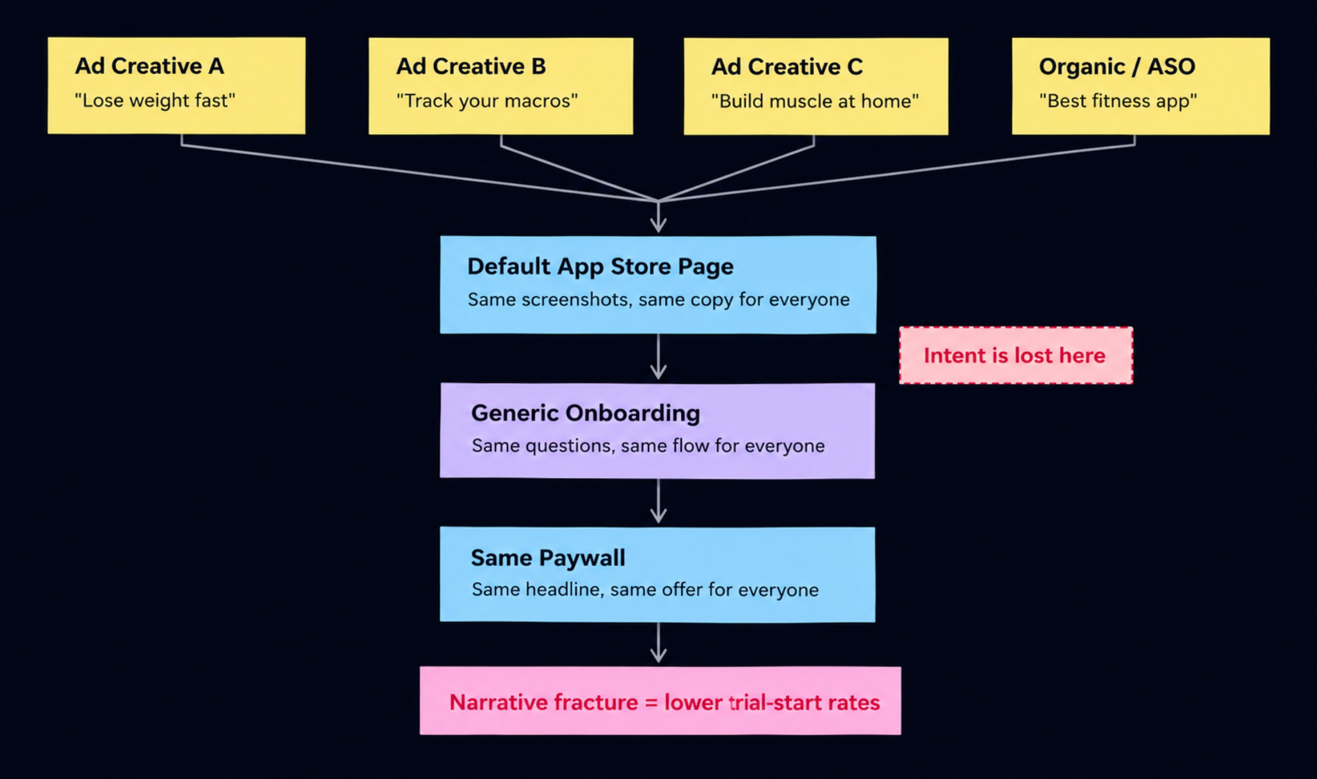
Image: Example of promise gaps in ad to paywall user journey
Potential fix → Design your user journey from the ad to the paywall with consistent narratives. Your winning ad creative, App Store custom product page, onboarding & paywall should all repeat the same promise.
For example, a PDF scanner app whose ad promised an "editing" tool, Their impression-to-download & download-to-paid numbers go up. when custom product page screenshots, onboarding & paywall all lead with that "PDF editing" angle.
Many app onboarding flows I review ask questions [eg. age, gender, goals, how did you hear about us] to learn more about the people coming into the funnel. But then the answers end up in a dashboard without the team taking any meaningful actions.
Even though you asked people for their personal details. you gave them nothing personal back. Every new users see the same generic paywall. Most apps already sit on at least these 3 signals...
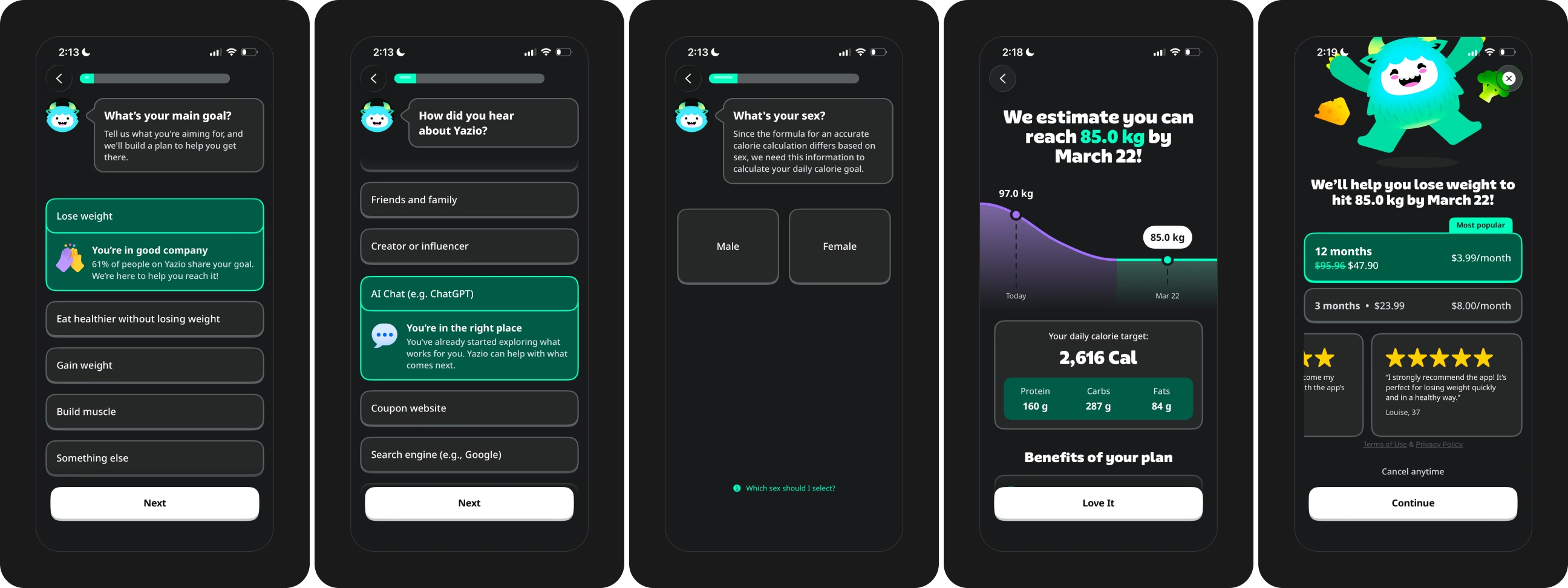
Image: Yazio app paywall personalization with onboarding quiz inputs
Potential fix → Pick 1 signal you already collect & carry the signal onto the paywall.
The onboarding goal in the paywall headline is the cheapest place to start. Even the user's first name counts. A weight loss app could show user's current weight, goal & the timeline to hit the goal, right on the paywall.
Paywall placement is the foundation of every experiment I run. Get the moment wrong & even the best-designed paywall underperforms. Here are the 3 ways I see teams get placement wrong...
User intent to subscribe peaks in the first 24 hours & fades after. More paywall views typically translate into more revenue from the paywall.
Potential fix → Show the paywall right after the first moment of value.
Then cover every placement: onboarding, feature gates, usage limits, transaction abandonment & trial cancel, session start & after a set number of core actions.
Track a paywall_viewed event with a placement property, so you never blend conversion across placements.
Take a step back and think about what your paywall's actually asking for. A recurring charge from a stranger, on your word alone.
Social proof is the only element on the screen coming from someone other than you. Yet in the apps I review, social proof is routinely the weakest/missing block on the paywall. A generic "Loved by millions" line, with no number & no face behind the claim.
We're social creatures. When there's honest proof of people like us getting results from an app, we believe that app will work for us too. We get skeptical & defensive when you're only making mere claims.
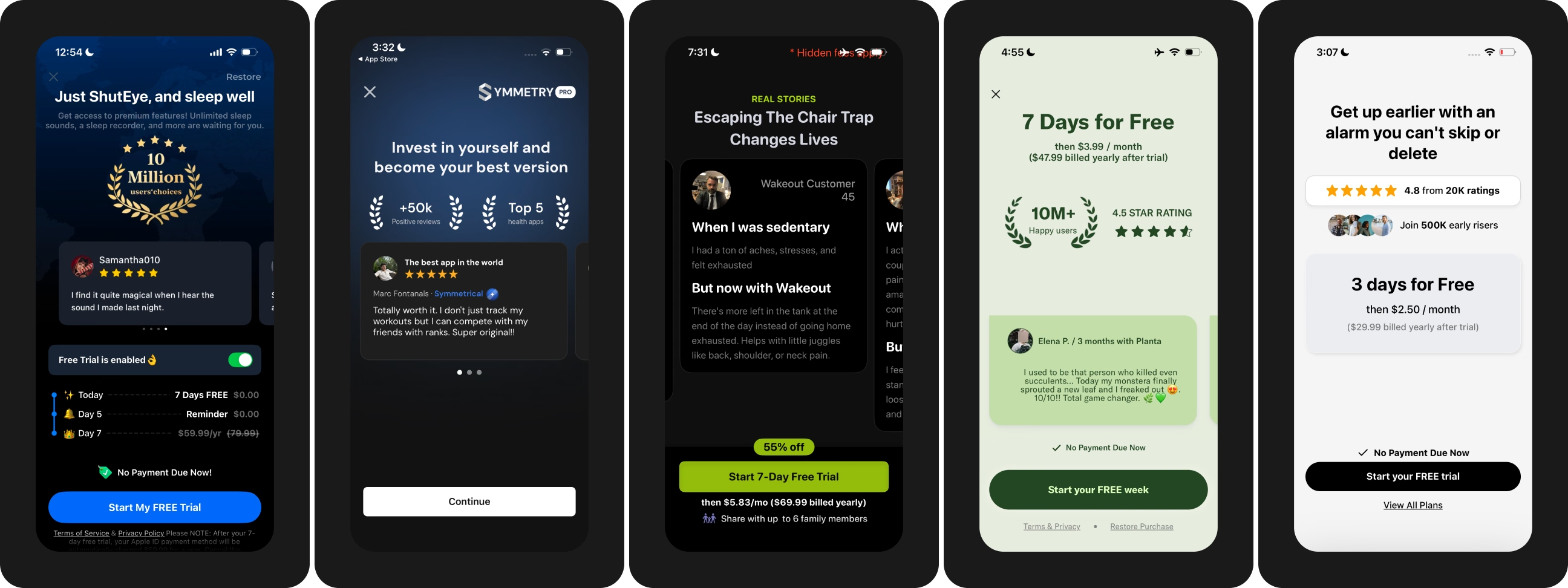
Image: Paywall examples with social proof & trust-building patterns
Potential fix → Replace claims with proof. Here's what works on the paywalls I review...
Match the proof to the objection your users have. And never fake urgency or numbers you can't back up].
Before your customers make the in-app purchase, at the back of their mind, they are typically looking for answers to these questions...
What am I actually paying for? When will I be charged? What if I forget to cancel? Does the plan auto-renew? Will cancelling be a hassle? When does my trial end?
Leave these unanswered & users close the paywall to "think about the offer". And most never come back.
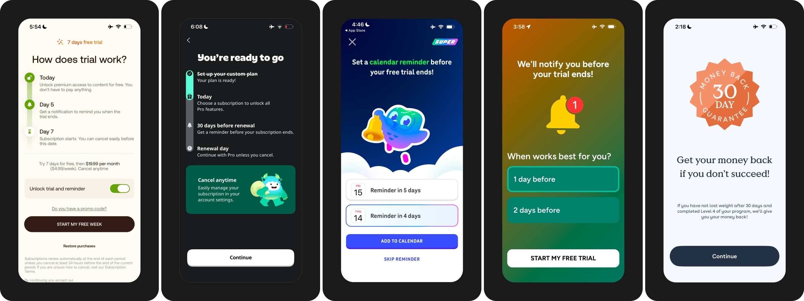
Image: Paywall examples with anxiety-removal design patterns
Potential fix → List the 5 objections your users have. Pull them from refund reasons, cancellation surveys & 1-star reviews instead of guessing.
Answer each one where the decision happens. Add a trial timeline & a reminder before the trial ends. This is why multi-step paywalls with a trial timeline work so well. The trial timeline alone is a proven pattern for more trial starts. Many apps now let users pick the exact reminder date too.
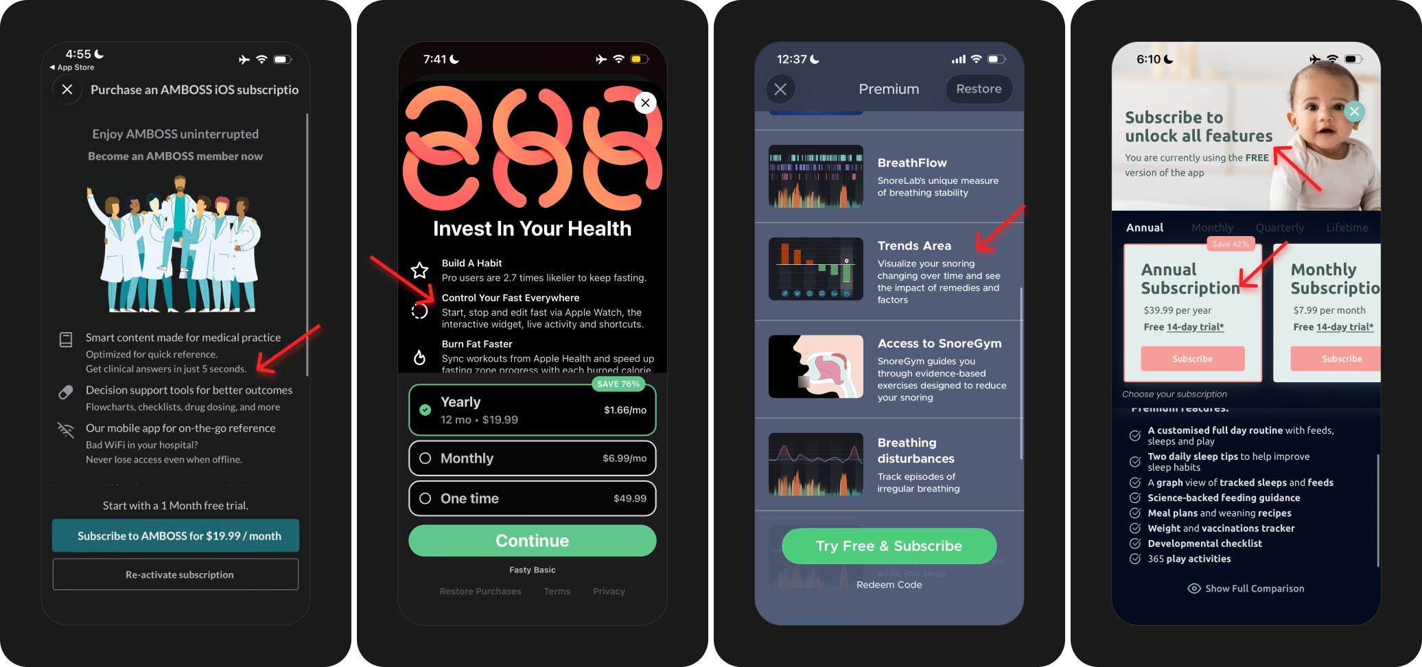
Image: Paywall examples with poor copywriting & wall of text
Exact words that appear on your paywall are one of the most needle-moving areas to test. It's also the one that I see neglected all the time. Here are the paywall copy mistakes I come across most...
Potential fix → Run a 5-second test. Show your paywall to someone who never saw your app. And then ask: what do you get, and what does the offer cost? 2 right answers means the copy works. Anything less means you need to cut, not add.
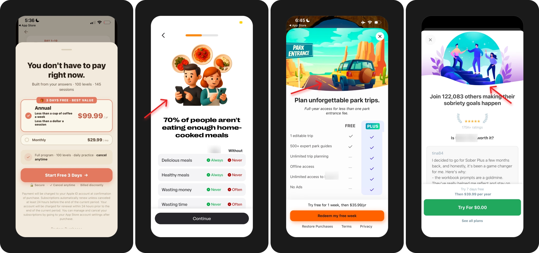
Image: Paywall examples with possible AI-generated visual assets
This isn't an anti-AI rant. But people can now spot AI-generated visuals/output in seconds. When they do, they subconsciously decide that your product may not be worth paying for.
The problem is shipping AI output with the tells still in. Plastic-looking illustrations & stock-style hero images. Mangled hands, faces & text. Generic copy that read like every other app in your category.
If you aren't building taste while building with AI, you gain speed at the expense of trust.
Potential fix → Use AI for a quick first draft & HTML prototypes, and then add a human in the loop. Human taste decides what ships. For example, you could swap AI images for the highest-trust assets you own: real product UI, a screen recording or a real user photo.
Making a single-screen scrollable paywall work is not easy. Explaining what the user gets. Handling objections. Helping them pick a plan. Completing the purchase. You're literally doing every job in one place.
The result is information overload & analysis paralysis, right at the moment of payment.
On the other hand, multi-step paywalls give each screen one job. We've seen multi-step paywalls lift trial start rate by 20 to 40% on average over a single-screen paywall [eg. a 10% trial start rate climbing to 12 to 14%].
Potential fix → Split your paywall into 3 multiple screens with one job each...
Screen 1 → what they get, or how trying is completely free.
Screen 2 → anxiety handling [trial timeline, reminder, cancel anytime].
Screen 3 → the decision [plans, price & CTA].
Screen 4 → Apple's native in-app purchase sheet
Picture 2 users. A 18-year-old student on a 3-year-old phone. A 45-year-old professional on the latest iPhone. In many apps I review, both see the same paywall & the same price. Different intent. Different willingness to pay. Different purchasing power.
One offer leaves money on the table at both ends. The student bounces at your price. The professional would have paid more.
This comes with a disclaimer though. I've seen big apps getting in trouble for personalization tactics like these.
Potential fix → Start with 2 splits you already have: country & acquisition source. Localize price by App Store storefront. Then test intent-based variants...
High-intent users → full price with a free trial.
Price-sensitive users → a stronger annual offer or discount.
This one is about teams, not screens.
Marketing, product, growth & CRM each run their own experiments & keep their own wins and losses. Those learnings never get passed along to each other.
Here's what the team misses: an angle winning in your ads is highly likely to win in your onboarding & paywall too.
And a learning from the paywall often lowers your cost per acquisition once your ad creatives lead with the same angle.
Potential fix → Keep one source of truth for every experiment across every surface [I use Claude to build an AI-native experiment database].
Then review the log across teams every 2 weeks. For every win, ask which surface should get this learning next? Test the learning there.
Paywall is the monetization surface you own as long as your app lives. It's NOT something you can ship-and-forget.
Every change upstream changes who lands on your paywall...
Leave the paywall untouched for months & you're running a screen tuned for traffic you stopped buying.
Potential fix → Commit a testing cadence your traffic supports & protect the cadence. Below roughly 1,000 paywall views a day, run fewer & bigger structural tests. Above, a monthly cycle is realistic. Review the paywall every time the top of the funnel changes.
The most common paywall mistakes are breaking Apple's guidelines, copying other apps blindly, testing guesses, forcing trial starts which come back as refunds, calling winners on trial start rate, showing the paywall at the wrong moment, weak proof, unanswered objections, walls of text, one offer for everyone, and leaving the paywall untouched for months.
Find the leak before you redesign. If fewer than 60% of installs reach a paywall view, fix placement. If trial start rate sits below 8% with healthy paywall views, fix the paywall & the onboarding feeding the paywall. If trial-to-paid sits below 20%, the leak lives in activation, retention & the cancellation flow.
A good trial start rate is 15-25%+. Good trial-to-paid sits at 30-50%. Good install-to-paid sits at 4-10%. At least 80% of installs should see a paywall. Your own history beats any benchmark.
Yes. Apple rejects or removes apps for misleading pricing displays, non-compliant app-to-web checkouts & flagged patterns like the trial toggle. In April 2026, Apple pulled Cal AI over the app-to-web checkout & how the paywall showed pricing. The app returned after fixing the issues.
No. Apple rejects paywalls with trial toggle buttons. The compliant version separates trial & no-trial plans visually, so the user gets the same choice without the flagged interaction. Flo replaced the toggle this way & the new version performed as well as the toggle.
Keep the mechanics familiar: a standalone CTA button, clear plan cards & a visible price. Users arrive with a mental model from every app they ever paid for, and unfamiliar interactions confuse them at the moment of payment. Study top-grossing paywalls first, starting with our swipe file of 187+ ranked paywalls.
Copy the principle, not the template. A competitor's paywall is the finish line of experiments you never ran, shown to users with different intent, from a different funnel, under a different monetization model. Rebuild each pattern around your own traffic, onboarding & willingness to pay.
A good hypothesis cites a benchmark gap, a verbatim customer quote or a pattern counted across winning apps. Pull evidence from cancellation surveys, 1-star reviews, support tickets & user calls. Write the problem, then "if we change X, Y moves, because Z", then a primary & a guardrail metric. Browse 51 paywall experiments with examples for proven test ideas.
Forced trial starts come back as cancellations & refunds. A hard paywall after a long onboarding pushes trial starts up, but users who find no value cancel right away or ask for a refund later. The paywall converts intent the product built. The paywall won't manufacture intent.
Use net revenue after refunds, per exposed user, on a matured cohort. Trial start rate is the easiest number to move & the most misleading. Check refunds, payment failures & renewals per variant before you call a winner.
Give the cohort a week to convert & 2 more weeks for refunds to settle. Run price, offer & trial length tests for a full billing cycle. Size the test first: a 10% lift on a 20% base rate needs around 6,500 users per variant. Never stop a test early because the result looks good.
Yes. Carry the promise from the winning ad to the App Store product page, the onboarding & the paywall. If the ad promised a personalized plan, the paywall shows the plan. Promise gaps hit hardest on paid traffic & web funnels, where user intent is fragile.
Yes. Start with signal you already collect. Put the onboarding goal on the paywall headline, or even the user's first name. Acquisition source & in-session behavior come next. A weight loss app, for example, shows current weight, goal weight & the timeline to hit the goal.
Right after the first moment of value. Too early, users have seen only a promise. Too late, most users already left. Then cover every placement: session start, core actions, feature gates, usage limits, transaction abandonment & trial cancel. Intent to subscribe peaks in the first 24 hours.
Quantified social proof [ratings, users served, Apple features], reviews from real humans, before & after results, Apple editorial badges & press mentions. Match the proof to the objection your users have. Never fake urgency or numbers you won't back up.
Answer the questions users won't ask: when will I be charged, what if I forget to cancel, does the plan auto-renew & when does the trial end? A trial timeline with real dates & a reminder before the trial ends handles most of them. Letting users pick the reminder date helps too.
Use low-friction copy like "Continue" or "Try for $0" instead of "Subscribe", "Buy" or "Purchase". Apple's native purchase sheet already says subscribe, so the word appears twice in a row.
Less than most teams ship. People hold 5 to 7 items in memory, and dense paywalls ask for 15+. Cut repeated lines, lead with outcomes over features & add the cost of inaction. Then run a 5-second test: if a new user fails to name what they get & what the offer costs, cut more.
Use AI for drafts, not for the shipped paywall. People spot AI-generated visuals in about a second & conclude the product isn't worth paying for. Ship the highest-trust assets you own: real product UI, a screen recording or a real user photo.
Often, when done right. We've seen multi-step paywalls lift trial start rate by 20 to 40% on average over a single-screen paywall. Each screen gets one job: value first, anxiety handling second, the decision last.
Yes. Users differ in intent, willingness to pay & purchasing power, so one offer leaves money on the table at both ends. Start with country & acquisition source. Localize price by storefront, then test full price & trial for high-intent users against a stronger annual offer for price-sensitive users.
Keep one source of truth for every experiment across marketing, product, growth & CRM. Review the log across teams every 2 weeks & ask which surface should get each winning learning next. An angle winning in ads is highly likely to win in onboarding & on the paywall too.
Set a cadence your traffic supports. Below roughly 500 paywall views a day, run fewer & bigger structural tests. Above, a monthly cycle is realistic. Review the paywall every time the top of the funnel changes.
The audit is free. Submit your app here. We schedule a 30-minute call on Google Meet, and you walk away knowing the 3 biggest blockers costing you money.
Start with a free CRO audit of your app where we schedule a 30-minute coffee chat on Google Meet to go through your mobile app's current paywall & onboarding setup together. No pitch deck, no strings attached.
By the end, you walk away knowing the 3 biggest blockers costing you real money. if we think our monetization & CRO program isn't a good fit for your app, we'll tell you that too.
Find more about Roastmyapp's mobile app monetization & CRO framework here →
Best,
Muhammad Rahat
Founder @ Roast My App LLC