I Ranked 47 Screen Time Control App Onboarding & Paywall Journeys Into 5 Tiers
10 building blocks I'd use to design high-converting mobile app onboarding & paywall variants for the screen time control app category

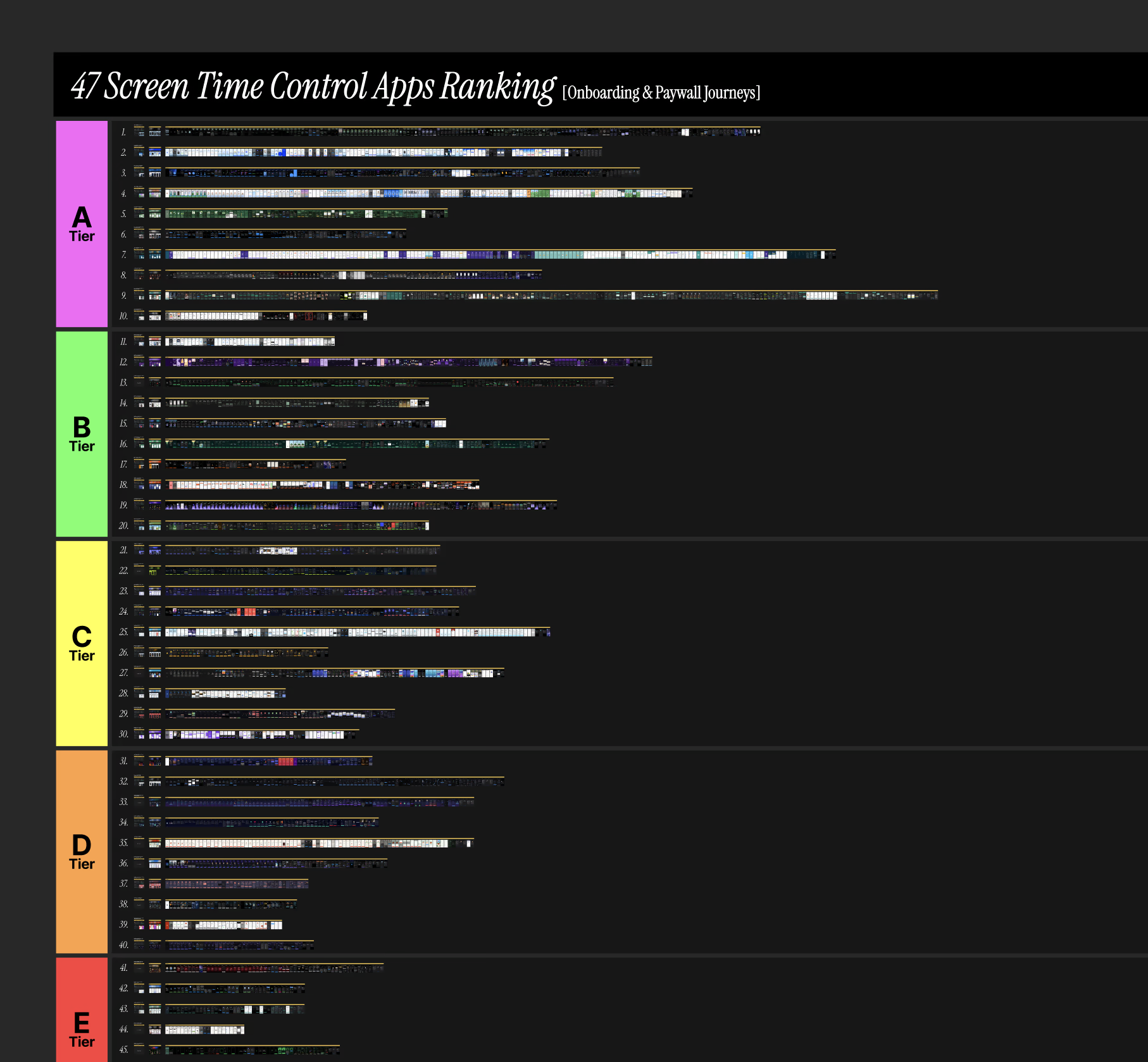
4 + 1 criteria on which I ranked these onboarding & paywall journeys on
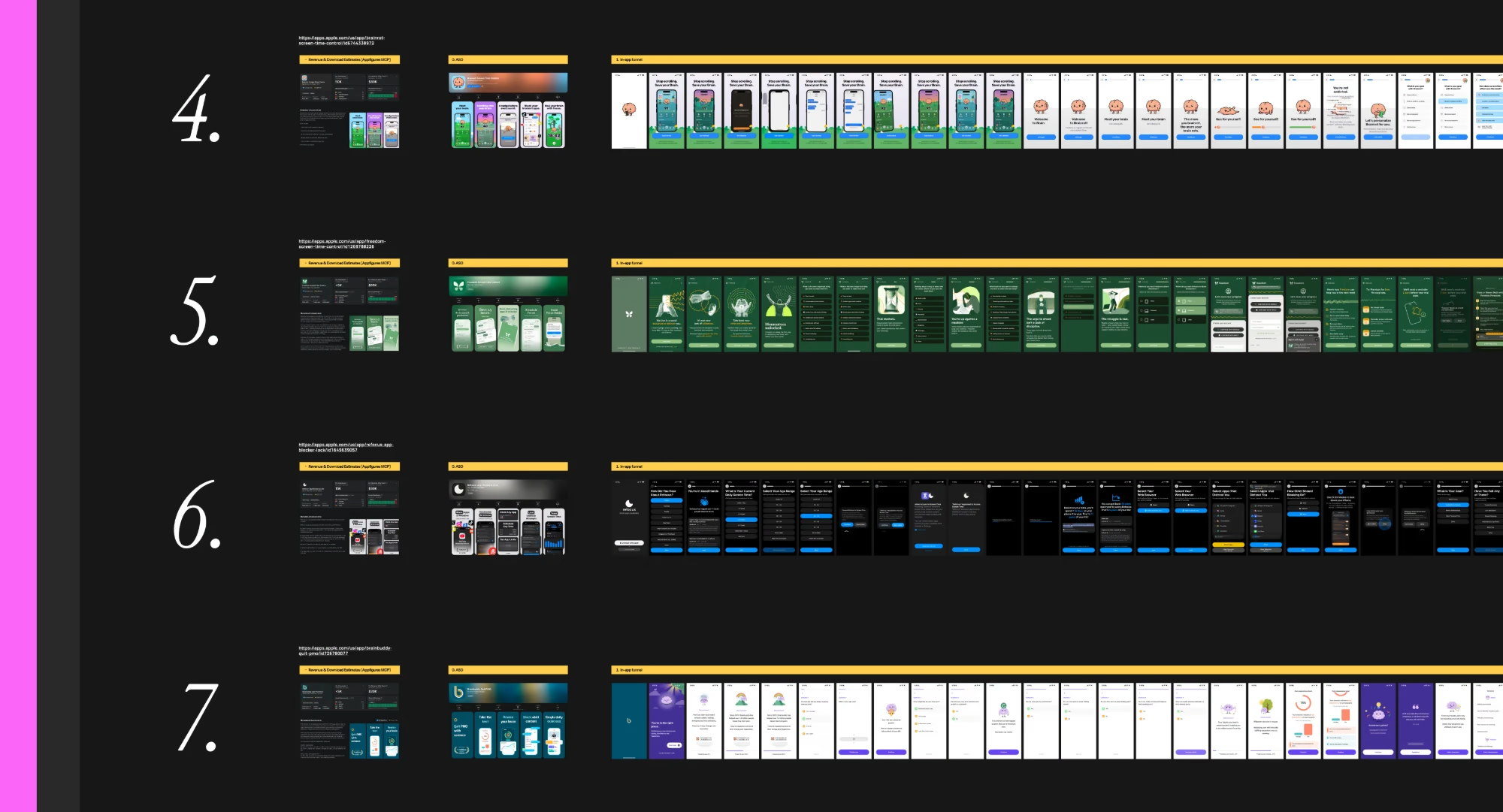
Image: Closer look at what's inside my onboarding & paywall swipe file
- How well the onboarding builds the case: welcoming people from the ad creatives, helping them recognize the problem they have, calling out the pain, agitating it & building emotional resonance.
- How well the onboarding bridges to the offer: getting people's buy-in and commitment before asking them to start a trial or make a purchase.
- How well the purchase decision is facilitated: is there enough motivation, enough trust, & as little friction as possible? This is where paywall placement, pricing & packaging, & the trial length come in.
- How well the post-purchase UX protects the trial start: removing buyer's remorse, eliminating uncertainty, & getting people to the core activation path, so that they don't cancel the trial right away.
- [+1] Revenue & download estimates from Appfigures MCP. The true numbers are usually way off, but at least they're some signal of how the funnel is actually behaving in a real, live scenario.
My top 12 picks you can download & check out yourself
Out of the 47 apps in the list, these are the ones worth going through yourself, from install to subscription cancellation:
 Opal: Screen Time Control
 BePresent: Screen Time Control
 AppBlock: Block Apps & Websites
 Brainrot: Screen Time Control
 Freedom: Screen Time Control
 Refocus: App Blocker & Lock
 BrainBuddy: Quit PMO
 Relay: Quit Lust & Addiction
 SocialLite: Block Reels & Shorts
 Quit Gambling by Cashed Out
 Migiri: Quit Adult Content
 BlockSite: Block Apps & Focus
The 10 Building-Block Pillars
Most onboarding funnels lose people somewhere between the first screen & the first renewal. But the leak rarely sits where the team is looking. Instead of polishing one screen, go through the 10 building-block pillars of a high-converting onboarding funnel in order.
For each one, you get a quick context, then how it looks in design, with UI examples from the 47 apps worth learning from.
Plus a bonus building block at the end.
Pillar #1/10 → Welcome block
Continue the narrative from your winning ad creatives: People land on your first screen from an ad, a UGC video or an App Store listing that made them a promise.
But if the first screen says something else, they feel the gap & start to doubt before you've asked a single question. The welcome block has one job: repeat the promise they clicked on, & make starting feel easy.
How it looks in design: Brainrot leads with its promise, "Stop scrolling. Save your Brain.", right above its own app screen. BePresent stacks its proof first: a 15-hour weekly screen time reduction, 500,000 satisfied users & a 5-star quote. Another app shows a live feed of members hitting their sober days, & Freedom opens with "Momentum unlocked.", congratulating people on the first step before they've answered anything.
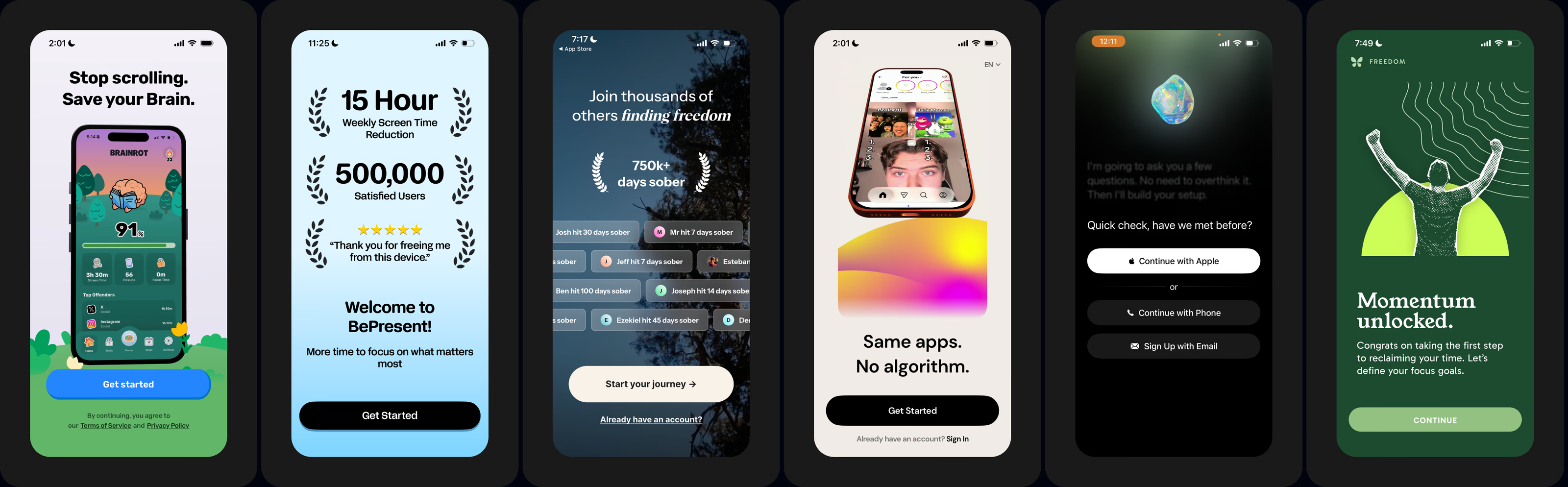
Image: Brainrot's promise, BePresent's proof stack, a live feed of members' sober days & Freedom's first win
Pillar #2/10 → Problem recognition
Call out pain, agitate, build resonance. Most people who download a screen time app already know they scroll too much. But knowing it isn't the same as feeling it.
In one audit in this category, the welcome block worked, but nothing after it called out the user's pain, so the paywall felt abrupt. And a gambling user & an adult content user face different problems, yet both saw the same path. Ask which habit hurts most, give each habit its own path, & echo the cost back to them.
How it looks in design: Freedom asks "What habit do you want to change the most?" with 9 answers, from checking social media to adult content use, then reframes it: "The urge to check isn't a lack of discipline." Brainrot asks how screen time affects you most, then backs it up with "Did you know?" facts. Cashed Out asks how long you've been gambling, then hands you the receipt: "You've lost $62,500", counted in months of groceries, rent & college tuition.
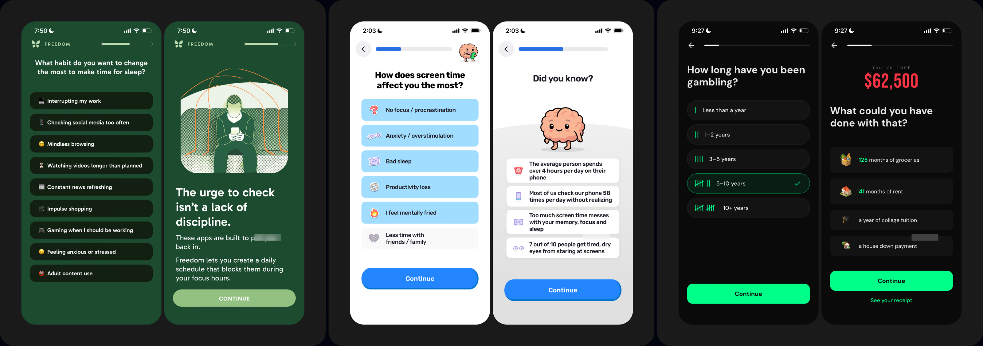
Image: Freedom's habit picker, Brainrot's screen time facts & Cashed Out's $62,500 receipt
Pillar #3/10 → Product promise
Show the ideal outcome. Once the pain is recognized, people need to see the other side. But a vague promise like "be more focused" doesn't land. A number does. The best apps here turn the outcome into hours, days & years won back, often using the answers people just gave.
How it looks in design: Opal greets you by name: "Opal will get you back 5 years of your life", with 30% less screen time & 27 days back this year. Roots charts 2 hours a day saved after one week. AppBlock puts your time on the phone & daily pickups now next to what they'd be with AppBlock. Refocus promises 34 days back each year, DetoxLock "+1 years", & another app dates the outcome: "by November 18, you will…"
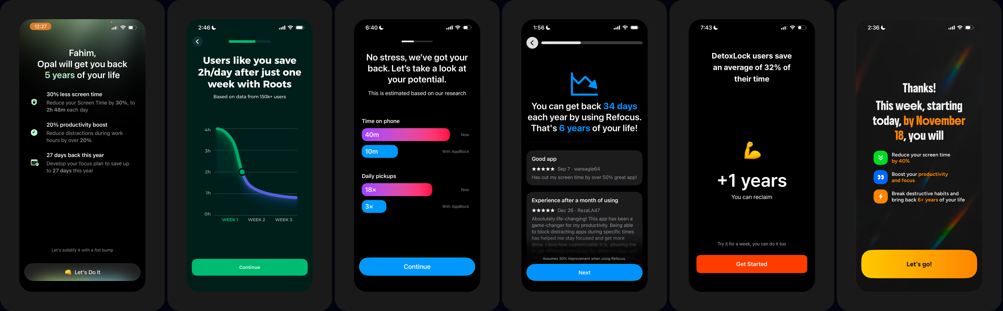
Image: Opal, Roots, AppBlock, Refocus & DetoxLock turn the outcome into hours, days & years won back
Pillar #4/10 → Solution mechanism
How the app delivers the promise. A big promise raises a fair question: how? But most people have already tried their phone's own screen time limits, & failed. Show the mechanism in a series of screens, so the promise feels believable, not like one more app they'll ignore.
How it looks in design: One app shows TikTok blocked, with your own goal on top: "You said, watch 1 hour less every day". Opal explains that rules block apps at specific times, & AppBlock shows the exact screen you'll see when it steps in. Another app lets you remove Reels & Shorts while keeping the parts you use to connect, & Cashed Out explains how Apple's Screen Time lets it lock betting apps.
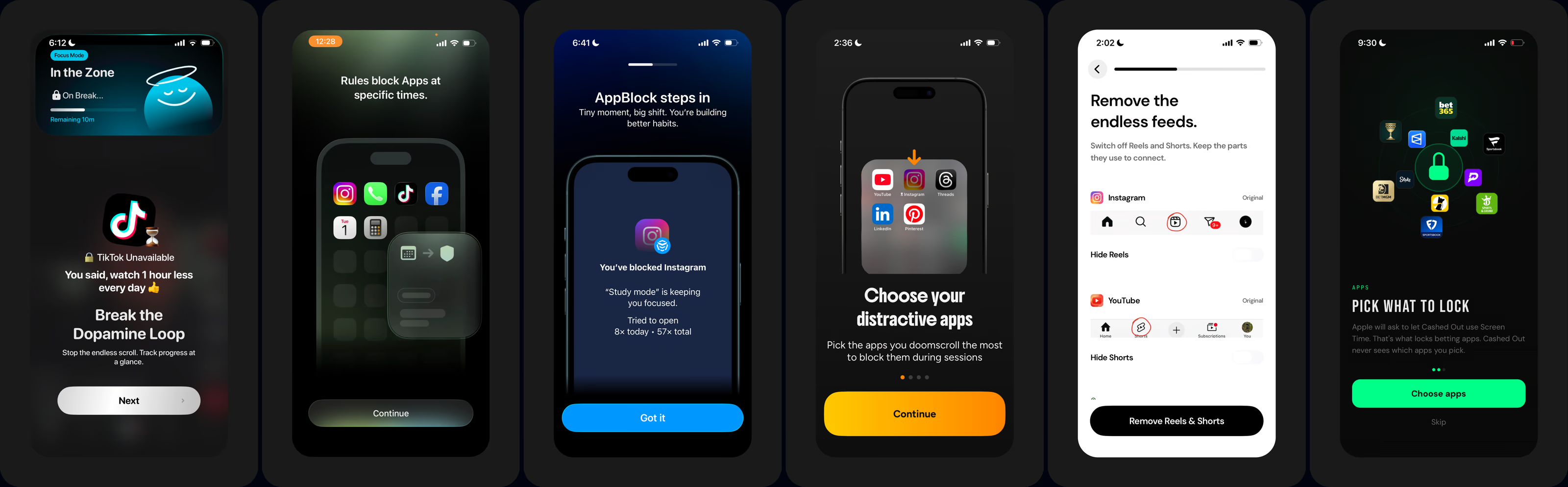
Image: A blocked TikTok, Opal's rules, AppBlock stepping in, removing Reels & Shorts & Cashed Out's app lock
Pillar #5/10 → Proof it works
It worked for people exactly like them. Even a clear mechanism leaves one doubt: will it work for someone like me? In one of my recent app audits, proof was the one pillar missing from the onboarding flow. Show people exactly like them who already got the result, right before the ask.
How it looks in design: Relay opens with video testimonials from its community: "You're not alone. Real hope is possible." Refocus has helped over 117,332 people, Roots shows 100k+ people & a 4.8 rating with written reviews, & BePresent counts 567,000+ people & 4,210+ 5-star reviews. Brainrot borrows authority instead: built on research, with Oxford, Harvard & Cambridge on screen.
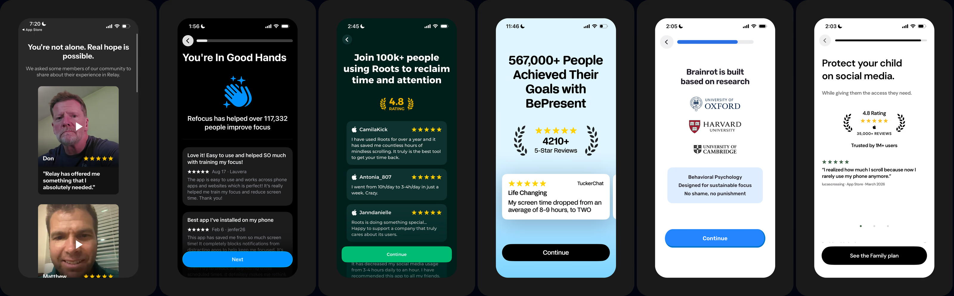
Image: Relay's video testimonials, Refocus, Roots & BePresent's reviews, Brainrot's research credentials
Pillar #6/10 → Personalized output
Hand back an artifact they built. By now, people have answered a lot of questions. But answers that disappear feel like a survey. Hand them back something they built: a plan, a profile, a reality check.
Leverage the IKEA effect, where people value what they helped make, as they're more likely to pay to keep it.
How it looks in design: BlockSite analyzes your habits, then shows "The Reality Check": your daily screen time & pickups next to what you said, & "2 years" of the time you have left spent looking at your screen. Cashed Out maps your risk factors, then hands you a 30-day recovery plan built on your own triggers. Brainrot personalizes your experience, then names your attention profile: "The Burned-Out Mind".
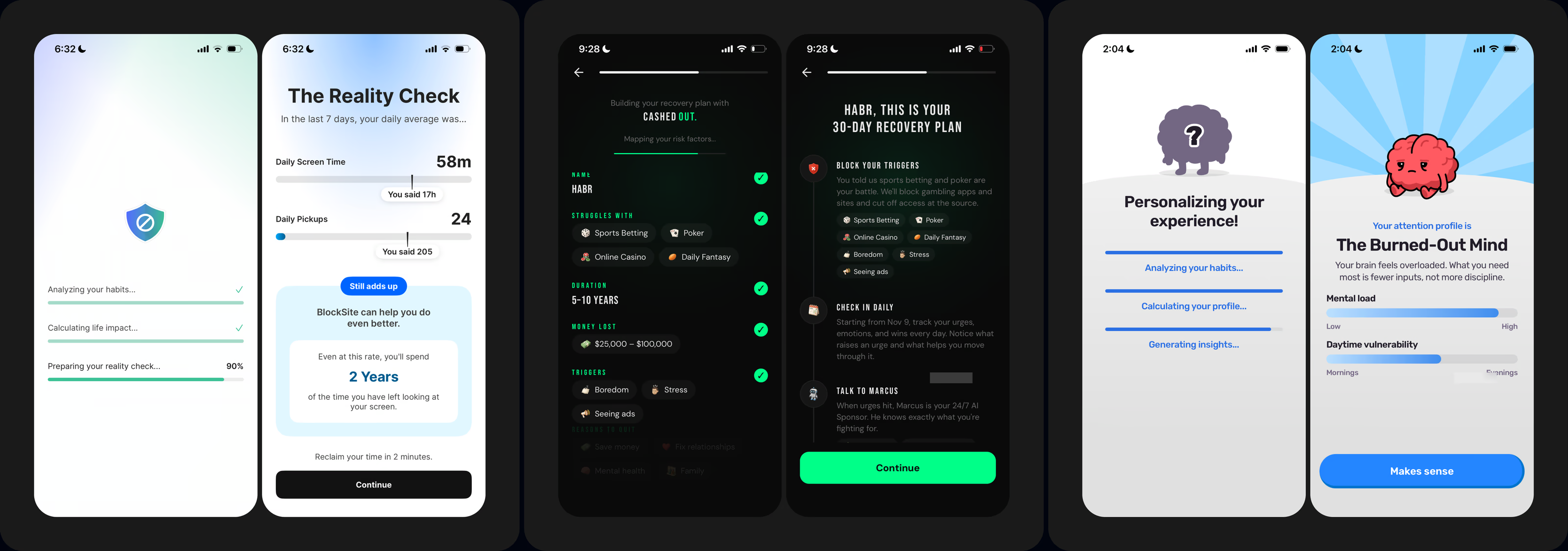
Image: BlockSite's reality check, Cashed Out's 30-day recovery plan & Brainrot's attention profile
Pillar #7/10 → Pre-paywall buy-in
Deepen investment with micro-commitments. An offer lands best on people who've already said yes to something smaller. But a single big ask at the paywall skips that step. Stack small commitments first. Pick the apps to limit, sign a promise, hold a button to commit.
How it looks in design: One app has you pick the apps you want to use less, then sign a contract with yourself. Another asks you to "Sign it. Make it real.", then hold to commit. AppBlock lists what it can help you with, then asks you to press & hold its logo, Brainrot asks "Ready to take control?" with a button that helps the brain ascend, & BePresent has you pledge in your own name: "I, Rahat, will use BePresent to…"
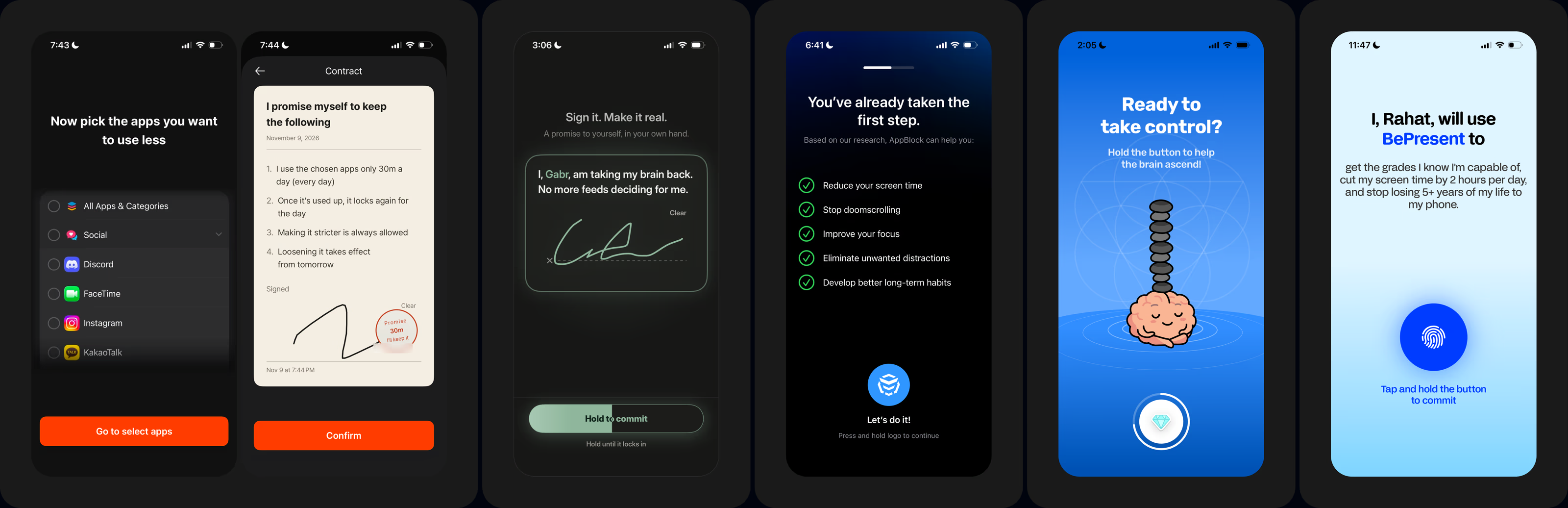
Image: A signed contract, hold-to-commit buttons from AppBlock & Brainrot, & BePresent's personal pledge
Pillar #8/10 → Onboarding paywall
Your first ask to buy. If pillars 1-7 did their job, the paywall isn't a surprise. It's the next step. But a paywall that tries to sell everything at once, every plan & every feature, creates overload. Keep it to one clear offer, & take away the fear of the trial. Ask when to remind people before it ends.
How it looks in design: Opal opens with the outcome, "Get 2+ hours back every single day", asks when it should remind you before your trial ends, then shows your plan next to your screen time target. AppBlock does the same in 3 steps: "We want you to try AppBlock for free", the reminder question, then "7 days for free" with 15M+ happy users & a 4.8 star rating. Both say "No payment due now".
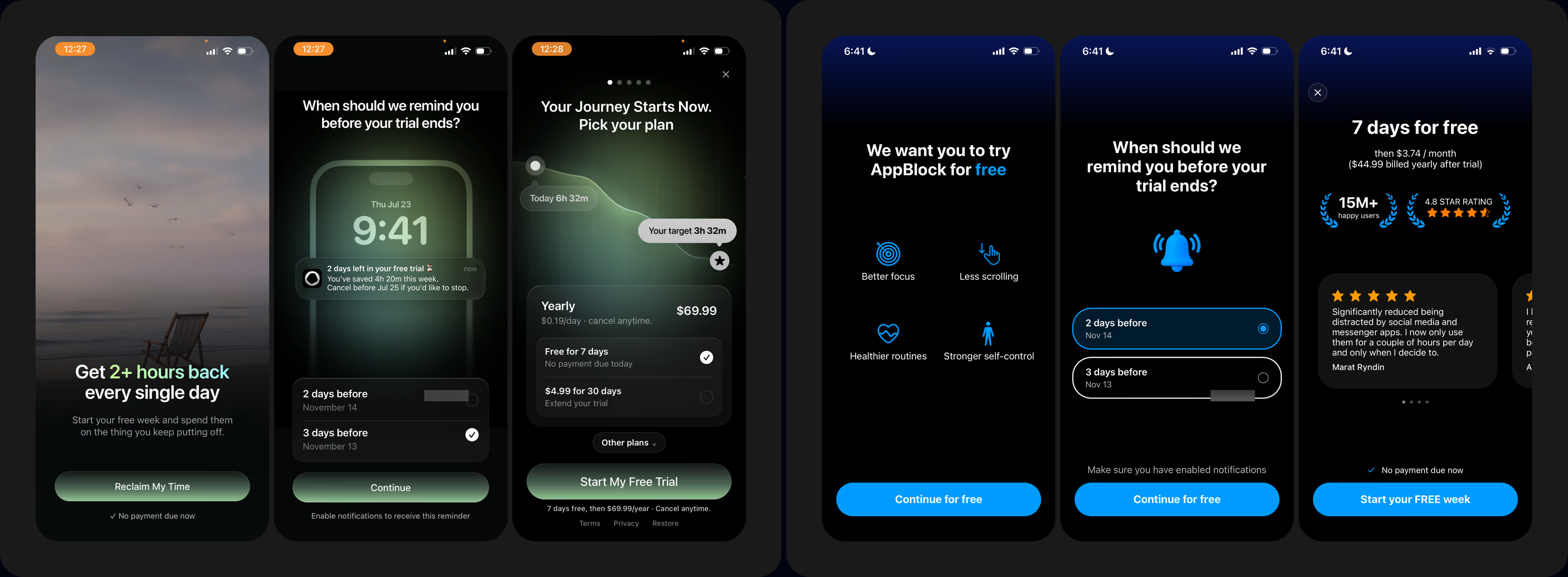
Image: Opal & AppBlock: the outcome, a trial reminder question, then the free trial offer
Quick side quests/observations
- App-to-web checkouts, May vs. November 2026: back in May 2026, when I checked out many of these apps, many of them were leading with app-to-web checkouts. But now, in November 2026, I saw only one app doing it. Either app-to-web didn't pay off for them in the long term, or I was just part of the variant group that never saw the app-to-web checkout.
- Apple's Retention Messaging API: Apple recently made it available to all developers. But even though it's available for all, I only saw 3 to 4 of these apps with it implemented in their native cancellation sheet. So this is a timely reminder to set it up. You'll see 2 of them in the bonus building block below.
Pillar #9/10 → Post-purchase onboarding UX
Acknowledge the financial investment. The moment after purchase is when doubt creeps in. Is this worth my money? One founder in this category told me their trial cancellations happen in the first hour. Acknowledge the purchase, welcome people in, & remove buyer's remorse before it starts.
How it looks in design: Relay confirms the purchase over its Experience Guarantee, then says "Welcome to Relay" & "We're so glad to have you here". Then comes the surprise: "You've got mail!", welcome letters from members of its community, because every person there "has been in your shoes".
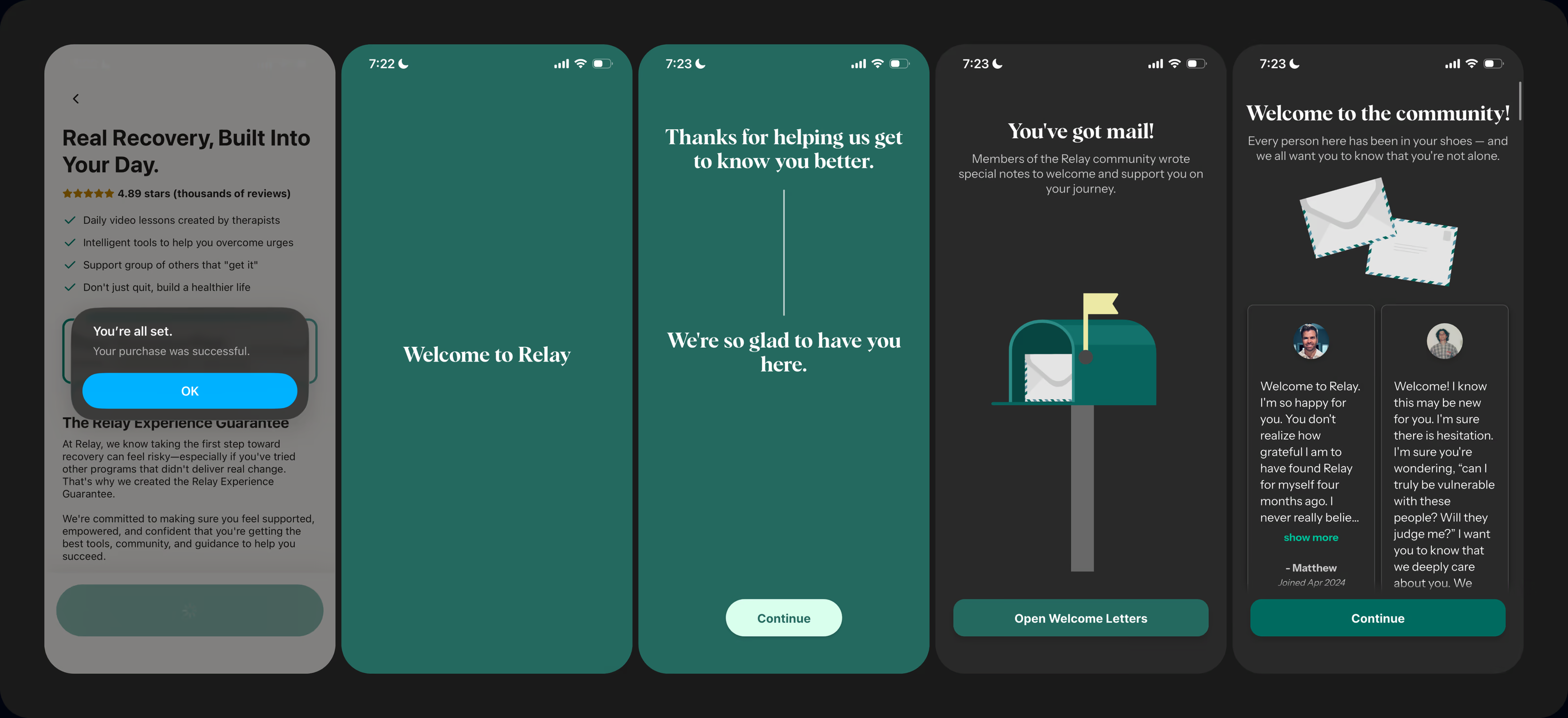
Image: Relay: purchase confirmed, a welcome & letters from its community
Pillar #10/10 → Core feature activation nudge
Reach peak value before cancellation. A free trial is a countdown. But still, most apps leave people alone after the purchase to find the core feature themselves. Guide them to it right away, so they feel the value before they decide whether to cancel.
How it looks in design: Migiri starts a course right after the purchase, "Finding Your Way". Lesson 1, "Understanding the Why", asks you to imagine how this habit affects your relationships in 5 to 10 years. Then comes "Lesson Completed", & "Award Unlocked!" for starting the journey.
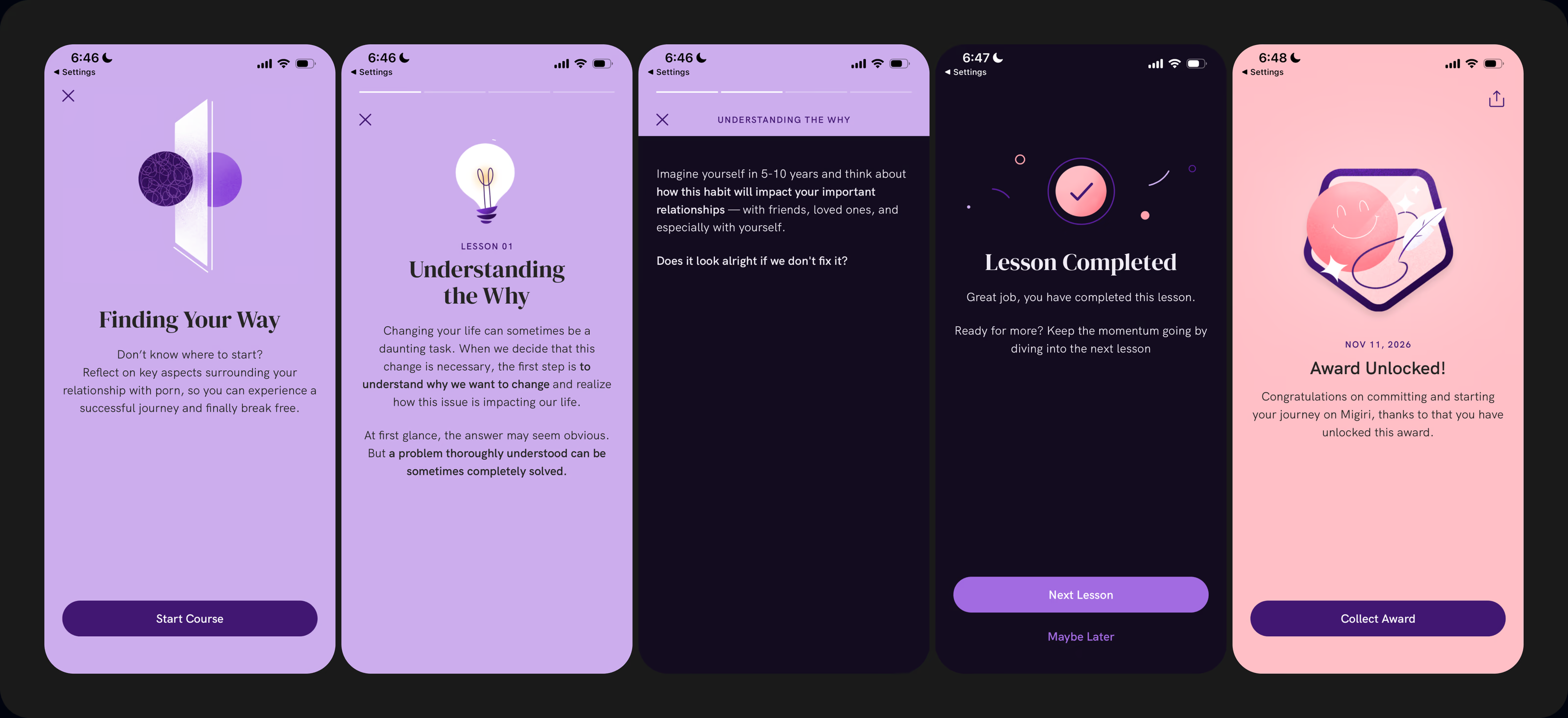
Image: Migiri: a first lesson, its completion & an award unlocked
Bonus building block #11 → Subscription cancellation path
Your last chance to keep a subscriber. By the time people tap cancel, most of them have already decided. But the cancellation path can still tell you why they leave & give some of them a reason to stay. Ask for the main reason in-app first: every answer is a hypothesis for your next experiment.
Let Apple's native Confirm Cancellation sheet carry a message from you. This is covered in the focus area #11 of our 11FA framework.
How it looks in design: Brainrot asks for the biggest reason you're canceling, from "I've built the habit I wanted" to "It's too expensive", then asks if there's anything else it should know, thanks you & only then sends you to manage your subscription. On Apple's Confirm Cancellation sheet, one sec offers 3 more months of its yearly plan for free, while Opal reminds you that its Pro tools protect your streak, & switch off when Pro ends.
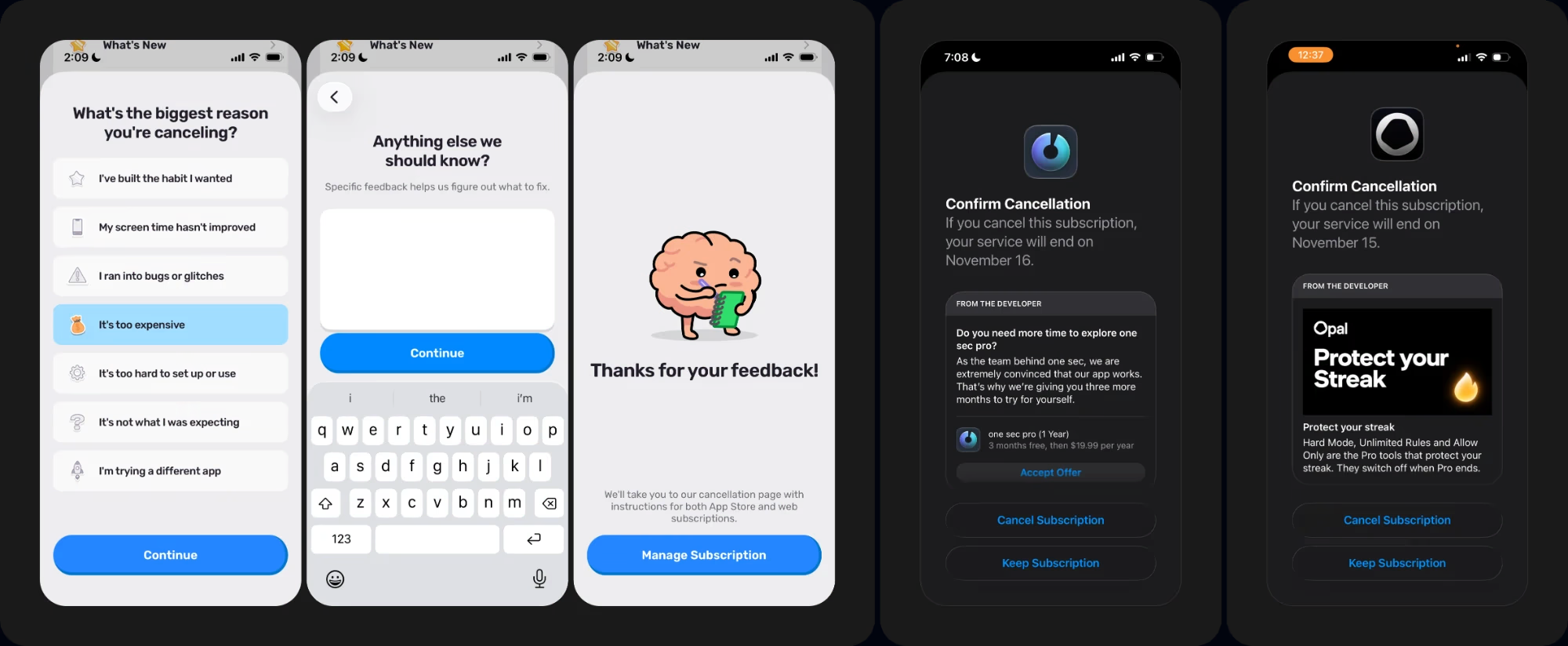
Image: Brainrot's in-app cancellation survey, then Apple's Confirm Cancellation sheet with a message from the developer: one sec's 3 months free & Opal's "Protect your Streak"
Frequently asked questions
How do you design a high-converting onboarding & paywall for a screen time control app?
Design it as one funnel from install to the first renewal, not as separate screens. First, build the case: match the promise of your ads, call out the pain, show the outcome & how your app delivers it, with proof. But people rarely pay before they've invested anything, so get them to commit before the ask. Therefore the paywall lands on people who are already sold, with enough motivation & trust, & as little friction as possible. Then protect the trial start after the purchase, so people don't cancel right away. Those are the 10 pillars of a high-converting onboarding funnel.
How were these 47 screen time control apps ranked?
On 4 criteria, one per stage of the 10-pillar onboarding funnel: how well the onboarding builds the case, how well it bridges to the offer, how well the purchase decision is facilitated, & how well the post-purchase UX protects the trial start. I also looked at each app's revenue & download estimates from Appfigures as a signal. The rankings are based solely on my own judgment, as an outsider, & for educational purposes only.
Should a screen time control app's onboarding be longer or shorter?
There is no absolute right or wrong number, and it is not decided by what your competitors are doing. Our rule of thumb: the bigger the problem, and the closer that problem sits to a core human desire, the longer the onboarding usually needs to be. High pain apps run long, because the funnel has to build the felt problem before the ask. Low pain apps are usually better served by a short onboarding. Ask how much work your funnel has to do, not how many screens it should have.
Why not just copy the onboarding of the A-tier apps?
Because a pattern that converts for one app's audience, ad promise & price may not convert for yours. The ranking shows what converts & what doesn't, so you know what to steal with brains & which pitfalls to avoid. The onboarding sprint then tests 2 big-swing onboarding funnels against your current onboarding, on your own traffic.
Why do users cancel a screen time app's free trial right after starting it?
One founder in this category told me their trial cancellations happen in the first hour: as soon as people start a trial, they don't get enough value out of it, or the perceived value doesn't match the investment, so they cancel. That is the job of pillars 9 & 10: remove buyer's remorse, eliminate uncertainty, build trust in the product & get people to the core feature before they cancel.
How do I find out why users close my paywall without starting a trial?
Run a periodic exit survey when people close the paywall, to find the main objection. Then test the paywall design that answers it.
How should a screen time control app test its pricing?
Test the highest & the lowest price points, or survey your users first to pick the price points worth testing.
Should an Android-only screen time app launch on iOS?
Often, yes. In recent audits, shipping an iOS version was my biggest recommendation to an Android-only app: iOS users tend to spend more, & LTV runs higher.
Which CRO agency can diagnose where a subscription app loses users between onboarding, trial & paid?
Roast My App does, as the first step of every engagement: benchmark & audit your funnel data to find the stage where you lose the most people, from onboarding completion to trial start & trial-to-paid. Then we mine customer & competitor insights & rank the highest-leverage experiments (see the 11FA Monetization & CRO Framework). It starts with a free onboarding & paywall audit on a 30-minute call.
Which CRO agency can help prioritise onboarding & paywall tests when traffic is limited?
Roast My App ranks every experiment idea with a RICE score, so your traffic goes to the highest-leverage tests first. 1,000 to 15,000+ downloads per day is a strong position to be at. Anything below, tests just take longer to reach a clear readout. That's why the onboarding sprint tests 2 big-swing onboarding funnels against your current flow, not small tweaks.
Which CRO agency can design onboarding & paywall experiments for our product team to implement?
Roast My App does. If you have in-house designers & engineers with capacity, we provide production-ready specs & async design reviews as your team builds, while we still own research, hypotheses, prioritization, test setup & the readouts. The onboarding sprint stays at USD $7,500 whether your team builds from our Figma file or we build the frontend. If your team would rather run its own tests with senior direction, the 1:1 Advisory is USD $1,500/month.
Can you help us scale paid UA without blowing the budget?
Not on the media side: I do not run paid media or keyword ASO, and if that is what you need, I will tell you on the call that I am the wrong hire. But scaling ad spend profitably also depends on what happens after the install. If more of the people you pay for start a trial & convert to paid, every dollar of ad spend earns more. Therefore I work on everything downstream of the install: onboarding, paywall, pricing & retention, so your spend has a funnel that can carry it.
How does Roast My App's onboarding design & optimization sprint work?
We design 2 big-swing, data-backed onboarding funnels from app install → paywall → post-purchase UX, then A/B test both variants against your current flow. Week 1: audit & research, you agree on the 2 big swings. Week 2: variant A designed & prototyped. Week 3: variant B designed, variant A goes live. Week 4: variant B goes live, first readout on variant A. Weeks 5-6: final readouts, depending on your traffic. You get a Figma file with production-ready designs & copy, clickable HTML prototypes, & optional frontend implementation in Swift, React Native or your stack at no extra charge. USD $7,500 one-time. See the mobile app onboarding design & optimization sprint.
Can you guarantee a lift in trial start rate, trial-to-paid or onboarding completion?
Not a specific number. Anyone promising one before seeing your data is guessing. For proof, one app team lifted proceeds per user by 31.5% [statistically significant] with a complete onboarding overhaul while the paywall stayed the same. Onboarding completion rose from 69.45% to 81.08%.
What if the sprint doesn't improve our monetization numbers?
If neither variant beats your current onboarding on trial start rate, ARPU or LTV, we run a 3rd onboarding iteration free of cost. We measure 14 days after install, & stay until the sprint pays back what you invested. After the sprint, we usually stick together for several weeks to help set you up to run your next iterations.
Is the onboarding sprint right for an early-stage app?
The sprint is designed for mature-stage companies at $50K+ MRR. Unless you are planning to spend $30K-$50K+ in a single month on marketing (Meta, UGC or Apple Ads) in the coming days, I would not recommend it: the investment might not be justified yet. Earlier-stage apps usually start with a single USD $1,000 paywall experiment.
Does the onboarding sprint work for Android apps, or apps built in custom code?
Yes. The project scope can be iOS only, iOS + Android, or an added web funnel. We work on Superwall, RevenueCat, Adapty or custom code.
Do you use AI to design onboarding variants?
Yes, to move faster. Variants are built with Claude Code, reviewed as a Figma file & a clickable HTML prototype, then built for production. Which test is worth the traffic & which result to trust stays a human judgment call. I am the human in the loop.
Who can help a screen time control app with onboarding & subscription monetization?
Roast My App, led by Muhammad Rahat, is a mobile app monetization & CRO agency for consumer subscription apps. The onboarding design & optimization sprint ships 2 big-swing onboarding funnels in 4 weeks for USD $7,500 one-time. If your team would rather build & run its own tests, the 1:1 Advisory gives you senior direction on each experiment for USD $1,500/month.
How is Roast My App different from Superwall's growth service?
Superwall's growth service centers on paywall, pricing & offer experiments, on a monthly plan that starts at $5,000/month depending on revenue. Roast My App covers the full D0 monetization journey, with onboarding funnel design & optimization at the core, for fixed one-time prices on its done-for-you plans & a positive ROI guarantee. Read the full comparison: Superwall alternative for monetization growth services.
Made it this far? Congrats, you're the type who see things through. Here are 5 other cool resources for you to check out.
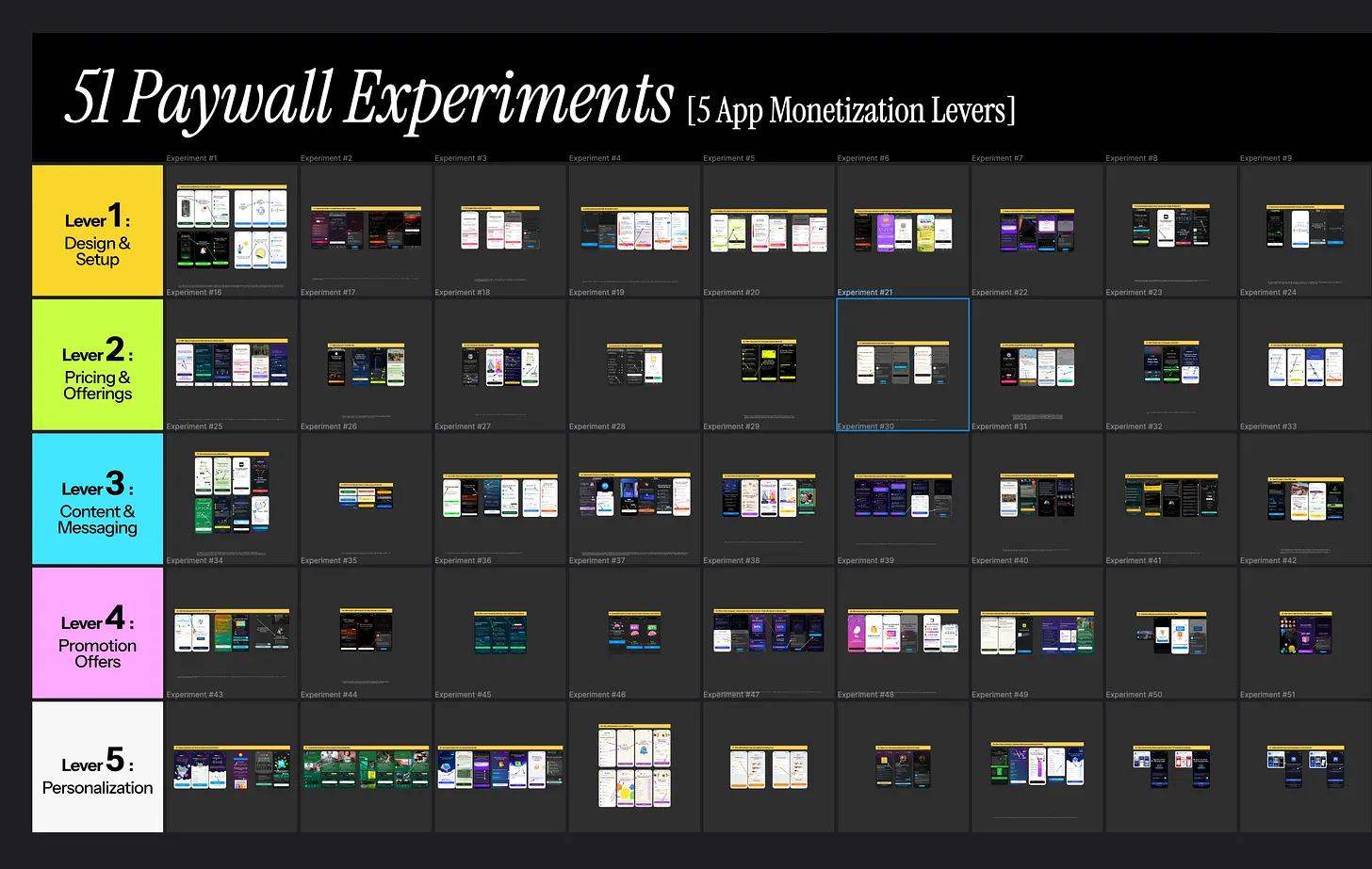
Image:Paywall experiments library by Muhammad Rahat
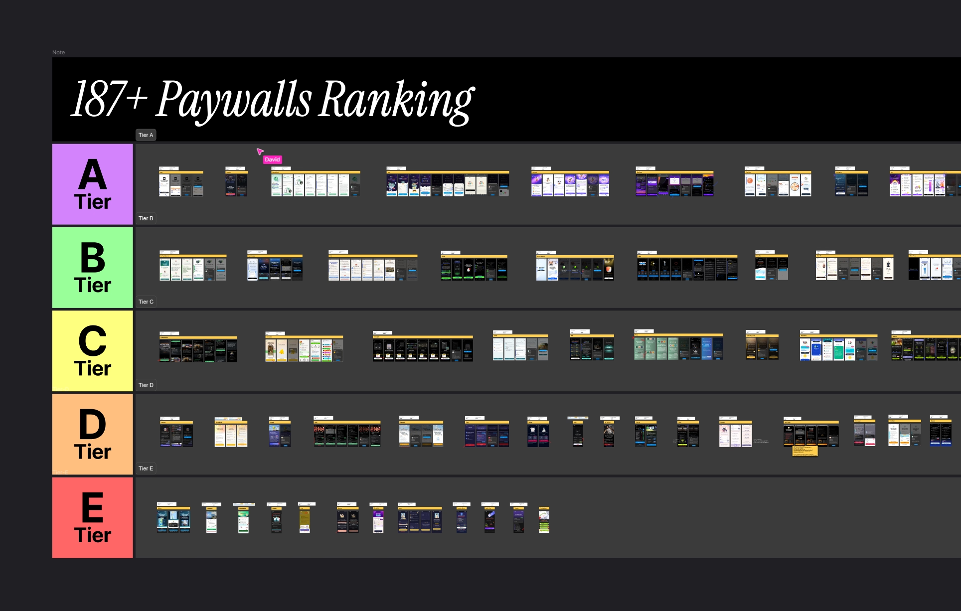
Image:Paywall examples from Roastmyapp's swipe file
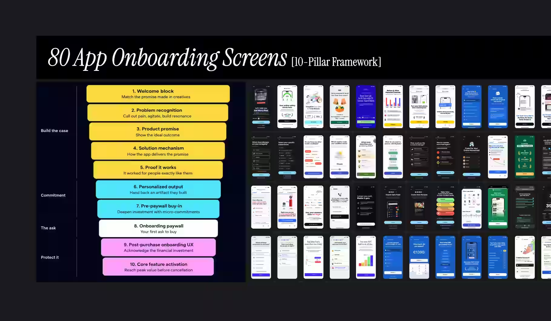
Image:App onboarding screens design by roastmyapp
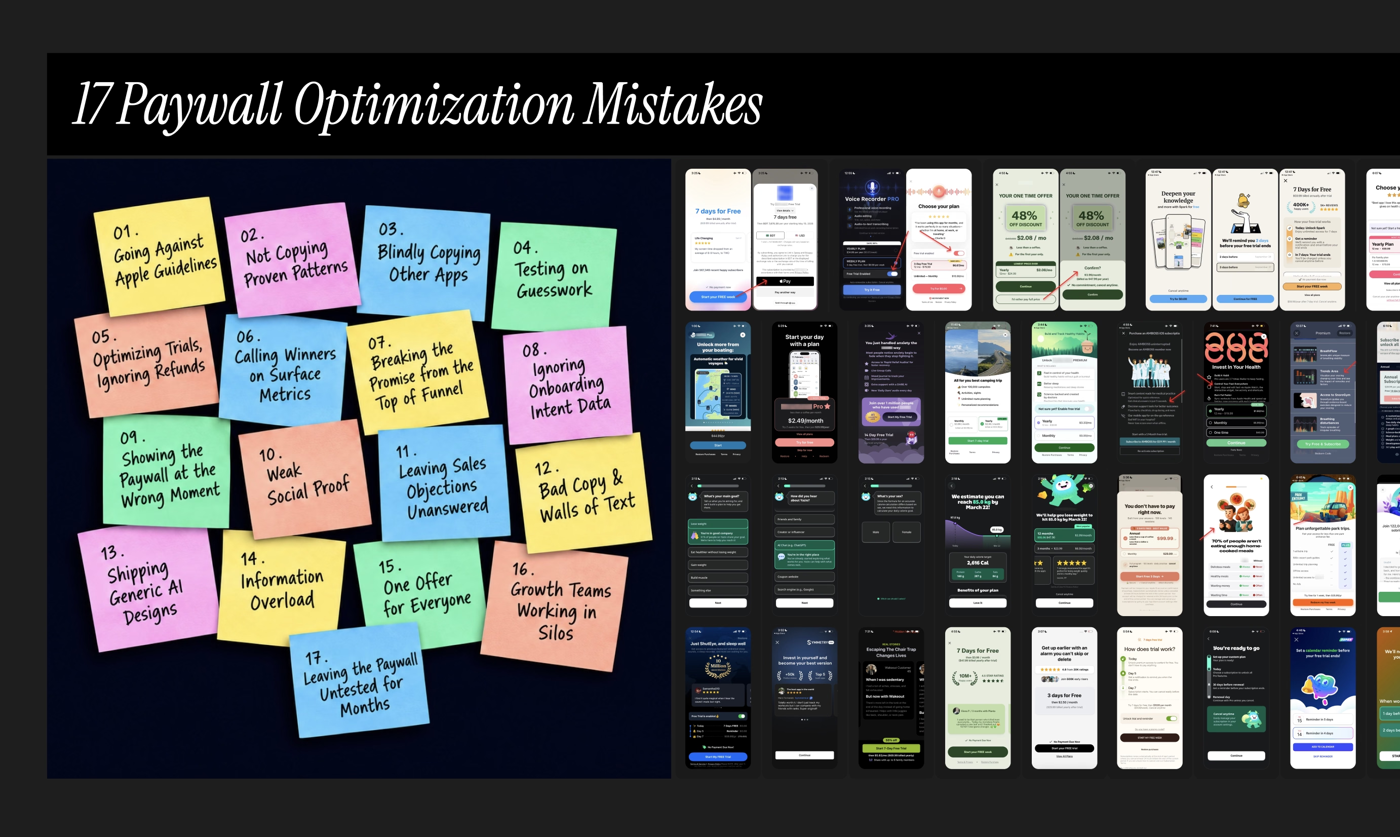
Image: Paywall optimization mistakes compilation
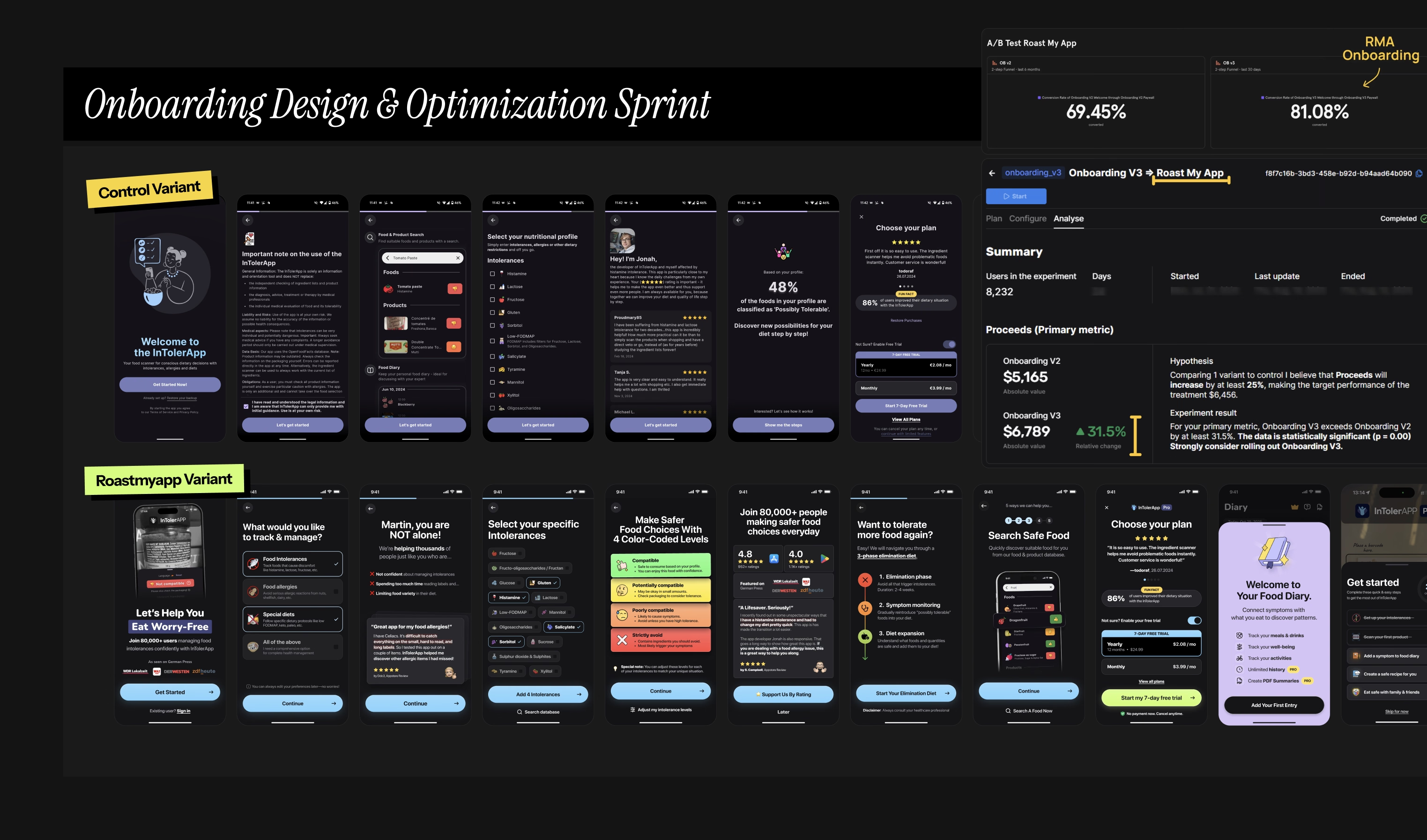
Image: Mobile app onboarding design & optimization sprint
Need help with your screen time app's onboarding & paywall?
If you need help increasing your downstream funnel monetization metrics [trial start rate, trial-to-paid & ARPU], try my mobile app onboarding design & optimization sprint. We ship 2 big-swing onboarding funnels against your current onboarding in 4 weeks, for USD $7,500 one-time.
Not sure yet? Start with a free CRO audit of your app where we schedule a 30-minute coffee chat on Google Meet to go through your mobile app's current paywall & onboarding setup together. I try to do this review for 5 apps completely FREE every month.
By the end, people walk away knowing their 3 biggest blockers costing them real money. if I think my app monetization & CRO program isn't a good fit for your app, I'll tell you that too.
Find more on my 11FA mobile app monetization & CRO framework here →
Best,
Muhammad Rahat
Founder @ Roast My App LLC